


Imagine a small business owner investing hours into a beautiful website, only to wonder why leads aren’t coming in. This scenario is more common than most people realize. In today's online world, a high converting website is not just about looking good—it's about understanding how customers behave and making every visit count. This article uncovers exactly how small businesses can use website structure, messaging, and design to guide visitors towards action—and explains why clarity beats complexity every time.
Understanding the High Converting Website: The Core Principles
At the heart of every high converting website is a clear focus on helping visitors become customers with as little friction as possible. For small businesses, this means that website design isn’t just about appearance; it’s about guiding a site visitor toward very specific actions like calling, booking, or submitting an inquiry. Conversion rate is the most important measure here—it tracks how many website visitors actually complete your business’s most valuable actions, not just how many people come to your site.
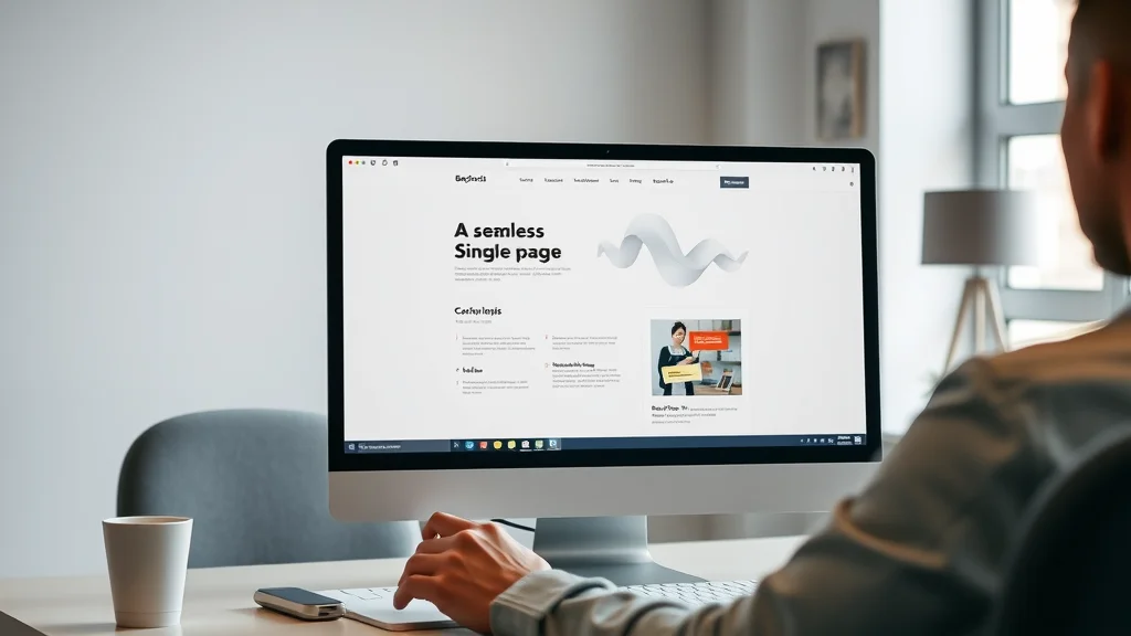
A high converting website begins with a knowledge of typical customer behavior. People online don’t behave like readers of a magazine or newspaper. Instead, they scan, scroll, and make quick decisions. The structure, speed, and clarity of your landing pages play a bigger role in generating leads than in-depth content or fancy graphics. Adopting a one-page website model, focusing on the essentials, and making everything easy to find increases the likelihood of turning a casual visitor into a new customer. No matter the small business—be it a coffee shop, dental clinic, or local electrician—the core principle is the same: clarity converts.

How Customers Behave Online and What It Means for Your High Converting Website
Online customers don't patiently read every word on a website. Instead, they arrive with a goal in mind and a short attention span—studies have shown this lasts around 8 seconds. Upon landing on your site, they instinctively begin scanning and scrolling, seeking immediate signs of trust and clarity rather than digging through multiple pages or links. If the first impression isn’t welcoming, clear, and directly related to their needs, most site visitors simply leave and check the next option in their search results.
This makes the design and user experience of a high converting website even more critical. The way your site presents information—strong headline, compelling imagery, and a prompt call-to-action—determines whether someone stays and takes action. Businesses lose countless opportunities not because of their services, but because the message and purpose aren’t instantly understood. Remember, first impressions online are formed within seconds, and small businesses must lead with clarity, not complexity, to stand out.
For small businesses looking to further refine their website’s effectiveness, exploring structured content strategies can provide a tactical edge. Implementing a structured local authority publishing approach can help organize your site’s information in a way that enhances both user experience and search engine visibility.
First Impressions: Why Website Design Matters More Than Ever
- Most visitors scan and scroll rather than deeply read
- The average attention span is around 8 seconds
- Immediate clarity builds trust and encourages action
The Role of Landing Pages in a High Converting Website
A landing page is one of the most powerful tools for small businesses seeking better conversion rates. Unlike traditional multi-page sites, landing pages are built around one goal—to convert. They remove unnecessary distractions and guide a visitor directly to taking the next step. Whether it’s to call, book, or get a quote, a single, focused answer to a user’s search intent means fewer choices, fewer clicks, and a smoother path to action.
Landing pages should emphasize the key value of the business with visible trust signals, concise content that matches the visitor’s intent, and a prominent call-to-action. Small businesses that dedicate effort to well-designed landing pages see improved rates of lead generation, as visitors are less likely to get lost or confused compared to sites with complex menus and scattered information. The path from arrival to conversion is short, simple, and clear—helping you stand out in a sea of options.

How Conversion Rate Reflects Site Performance
Conversion rate is more than a marketing buzzword—it’s a direct reflection of how well your website meets visitor needs. If a website gets plenty of traffic but has a low conversion rate, it’s likely that users are encountering friction: unclear messaging, slow loading, or an unclear call-to-action. A high converting website is measured not by the number of visitors, but by the number of actions those visitors take—calling, booking, or submitting inquiries.
To truly understand your website performance, review how many site visitors are taking your desired step on the first visit. Optimizing for a better average conversion rate (even small improvements) can be more effective than increasing the number of visitors alone. The most successful small business websites continuously test and refine landing pages, site layout, and content presentation to make the journey from browsing to booking almost effortless.
A high converting website turns more visitors into leads by removing confusion and guiding users toward the next step quickly.
Key Features of a High Converting Website for Small Businesses
One-Page Website Structure: Simplifying the Conversion Path
Traditionally, many small business websites have lots of pages—about, services, gallery, contact, and more. But more pages mean more clicking, more searching, and more chances for visitors to become confused or distracted. One-page websites flip the script by placing everything a potential customer needs in one structured, scrollable flow. Visitors simply scroll down, encountering your core offer, customer testimonials, key information, and a clear call-to-action in a logical, uninterrupted sequence.
This structure matches today’s browsing habits, especially on mobile devices. With less friction, visitors move smoothly from discovery to decision. There are fewer opportunities to get lost, fewer reasons to leave, and a greater likelihood of conversion. For a small business, adopting a one-page model leads to higher engagement and better results—something that is increasingly important in local search competition.
Clear Value Proposition and Messaging on High Converting Websites
A strong value proposition answers the question every site visitor is asking: “What’s in it for me?” This should be visible right away, with clean, confident messaging that instantly communicates what your business offers, who it helps, and how to take the next step. High converting websites put their best messages and most important actions ‘above the fold,’ meaning visitors see them right away without scrolling.
Messaging should be simple, jargon-free, and tightly focused on the user's intent. Support this messaging with a compelling headline, a visible call-to-action, and easy-to-find contact or booking information. When a visitor lands on your site, they should know within seconds if you can solve their problem, and exactly how to start. This focus is what transforms a visitor’s interest into real action.
- Strong, visible call-to-action
- Easy-to-find contact or booking information
- Concise copy that matches user intent
The Impact of Page Speed and Mobile-First Website Design
Today, most website visitors are browsing from their phones. A mobile-first approach means designing your website to work perfectly on every screen size, with buttons, forms, and calls-to-action that are easy to use on mobile devices. Slow-loading sites are a top reason visitors leave—modern customers will abandon a page that takes too long or is difficult to use on a phone. Prioritizing mobile-friendliness and fast page speed is now essential for every small business.
Page speed is not just about keeping visitors happy; it also impacts website conversion and search engine rankings. A fast, responsive design signals professionalism and helps create trust. Every extra second it takes for a website to load increases the chance a visitor will move on to a competitor. Investing in mobile optimization and page speed is an investment in customer satisfaction and better conversion rates.
Mobile Browsing Habits and Their Effect on Site Conversion
As more people use smartphones to search and contact local businesses, the need for mobile-first design becomes clear. Buttons should be big enough to tap, forms should be simple, and scrolling should feel smooth and intuitive. Mobile visitors expect an effortless experience; even a little friction can turn them away. Sites that are designed with mobile devices in mind not only provide a better user experience, but also give visitors a reason to take that next step and become a customer.

Why Slow Sites Kill Conversion Rate
Few things hurt site conversion faster than a slow website. Every extra second it takes to load risks losing another potential customer. Modern visitors are used to instant results and can grow impatient quickly. A slow site can cause visitors to question your business’s professionalism or even its reliability. That’s why a high converting website must prioritize speed and efficiency—especially as part of conversion rate optimization and delivering great user experience.
Use of Social Proof and Trust Signals in a High Converting Website
Social proof is crucial for convincing new visitors that your business is trustworthy and reliable. When prospects see reviews, testimonials, and endorsements from others, they gain confidence in your services. High converting websites place customer testimonials, professional accreditations, and security badges in visible locations, reinforcing that your business is legitimate and valued.
Trust signals also include professional design, privacy notices, and real photos of your team. These elements help reduce any hesitation a visitor might have, increasing the chance they’ll take the action you want—whether booking, calling, or submitting a form. Highlighting these on landing pages and near calls-to-action provides that final push toward conversion.
- Customer testimonials and reviews
- Professional accreditations and security badges
Reducing Navigation and Clicks for Higher Conversion Optimization
Every click required to find information introduces the risk that someone will leave your site. A high converting website eliminates unnecessary navigation and keeps the journey simple. This means fewer menus, shorter forms, and less hopping between pages. Instead, everything a visitor needs is right there, structured in logical sections and easy to scroll through.
By reducing navigation, you can guide site visitors to your primary offer and call-to-action more efficiently. This is a key principle of conversion optimization: fewer distractions and lower cognitive load lead to better results. When a website puts the user’s needs first and makes decisions for them, it helps users stay engaged and increases the chance of conversion.
Driving Conversions: Guiding Users on High Converting Landing Pages
Clear Next Steps: How to Drive Conversions on Small Business Websites
The most successful small business sites clearly guide users to take the next most important step. That’s why a landing page or one-page site positions calls-to-action—like “Book Now,” “Call Today,” or “Get a Quote”—right at the top and in other high-visibility areas. Contrasting button colors grab attention, and the offer is restated throughout the page as a reminder. This reduces the need for thinking or searching, letting site visitors act immediately.
Removing distractions helps the user focus. Fewer links, limited navigation, and a single conversion goal improve conversion rate. For example, rather than sending someone through multiple forms or asking them to click back and forth, the process should be as linear and simple as possible. Every design choice should answer one question: “Does this help my visitor act quickly and confidently?”
- Position the most important actions above the fold
- Use contrasting buttons for call-to-action
- Minimize distractions and unnecessary choices
Consistency and Clarity: How Website Conversion Can Be Improved Over Time
Improving a high converting website is not about dramatic redesigns but about small, regular updates. Businesses that continually test headlines, calls-to-action, and even button colors see measurable increases in conversion rates over time. Website conversion is about clarity and consistency—it’s easier to build trust and recognition when your site feels familiar and reliable at every visit.
Each adjustment—whether making forms simpler or clarifying your value proposition—reduces confusion and improves conversion. Over time, these small steps add up, turning more traffic into leads and customers. Monitoring analytics and feedback, then acting on them, is the hallmark of a website designed to nurture growth.
| Traditional Multi-Page Website | High Converting One-Page Website |
|---|---|
| Multiple clicks to access info | Info presented in single scroll |
| Complex navigation | Simple, natural navigation |
| Requires more attention and time | Fast, focused, and direct path to action |
| Higher chance of abandoning visit | Lower friction; more likely to convert |
| Content spread across many pages | All essentials available at a glance |
How Small Businesses Compete for Online Attention with a High Converting Website
Competing Factors: Website Clarity, Offer, and Ease of Action
Small businesses face fierce competition—not just from similar services, but from every other result in a customer’s search. When a potential customer compares websites, they often decide within seconds which business is easiest to understand and contact. In most cases, they will contact the first business whose offer and value are obvious. It isn’t about having the longest history or the flashiest reputation; it’s about immediate clarity and smooth action.
To compete, a high converting website must prioritize clear messaging, logical structure, and visible calls-to-action. The ease with which a visitor can contact you or make a booking will often be the deciding factor—even more than your online reviews or years in business. When businesses compete on clarity, not just quality, the results are better lead generation and more calls from new customers looking for quick answers.
Most customers will choose the business whose website is easiest to understand, not just the one with the best reviews or the longest history.
Why Many Websites Get Traffic but Fail at Lead Generation
It’s common for small businesses to invest in a website and see regular traffic, yet still struggle with lead generation. The difference often comes down to how well the site guides visitor behavior. Traffic alone doesn’t guarantee customers; your website needs to make the action you want obvious and easy. Common pitfalls include unclear offers, complicated booking processes, or too many competing choices on the page.
Design decisions—like where you put your contact info, how easy your forms are to use, and whether visitors know what to do next—impact whether someone takes action. Even excellent businesses lose leads when their websites don’t fit how people really browse. A streamlined, well-designed site helps guide visitors towards your business goals, rather than just providing information.
How Site Conversion Comes Down to Design, Not Just Content
While content matters, a site that converts is built on design choices that match user behavior. People expect visual cues for what to do, clear pathways to take action, and minimal barriers between themselves and your business. Content that is buried, hard to read, or presented on multiple confusing pages drives down site conversion. Prioritizing design, navigation, and layout decisions will always have a greater impact than simply adding more content or keywords.
Visibility, First Impressions, and High Converting Website Results
Connecting Visibility with Decision-Making: Why Clarity Leads to More Leads
Online, your business’s visibility means little if your site isn’t clear. In a world where customers judge within seconds, the decision to interact depends on clarity, not just presence. A high converting website leverages that initial impression, using structure, design, and messaging to build trust and guide visitors to action. When small businesses combine strong visibility (good search engine presence) with immediate clarity (obvious value and next steps), they see better conversion rates and more new leads.
Confusing layouts, unclear offers, or slow load times cause even interested visitors to click away. Instead, prioritize making every element of your page easy to understand. Use contrast, spacing, and clear sections to highlight the most important details. Remember: the business that is easiest to "get" is the one most likely to be contacted and chosen by customers online.

Common Reasons Visitors Leave Without Converting
- Unclear message or confusing structure
- Too many choices or hard-to-find call-to-action
- Slow-loading websites or poor mobile experience
Improving High Converting Website Performance: Small Steps, Big Results
Most improvements in website conversion come from smaller, incremental changes. Simplifying language, highlighting your value proposition, making buttons more prominent, and improving page speed all add up over time. Monitoring user behavior with analytics, collecting feedback, and testing layout changes lead to better results and a higher average conversion rate.
Remember, perfection is not the goal—steady, consistent progress is. Each improvement builds recognition and trust, giving your small business a better reputation and greater reach in local search. By focusing on clarity and ease of use, you can turn more visitors into actionable leads, growing your business step by step.

People Also Ask: Answers to Common Questions About High Converting Websites
What are high converting websites?
A high converting website is one that consistently transforms visitors into leads, customers, or clients by making their next steps obvious and reducing any friction or confusion during the visit.
Which website has the highest conversion rate?
While there is no single answer, websites recognized for very high conversion rates usually share characteristics like strong value statements, minimal distractions, swift page speed, and clear paths to action.
Is 12% conversion rate on a website good?
A 12% website conversion rate is considered excellent in most industries, but the number should be compared to similar businesses and ongoing optimization should be the goal.
How to create a high converting website?
Focus on a one-page structure, strong messaging, visible calls-to-action, mobile-first design, and use of social proof to guide users toward action and minimize friction.
What You’ll Learn
- Understanding how visitors interact with websites
- Key features every high converting website needs
- Practical design decisions that drive higher conversions
- How small improvements create better results over time

Frequently Asked Questions (FAQs) About High Converting Websites
What does conversion mean on a website?
Conversion refers to the process of turning a website visitor into a lead, customer, or client by guiding them to take a specific action such as making a call, booking an appointment, or submitting a contact form.
Do all small businesses need a high converting website?
Yes, every small business benefits from a website that makes it easy for visitors to understand their offer and take action. Even if most business comes from referrals or social media, a high converting website increases the chance visitors will reach out.
How does mobile website design impact conversion rates?
Mobile website design is essential because most customers today browse on their phones. Sites that are fast, responsive, and easy to use on mobile devices have much higher conversion rates compared to those that don’t work well on smaller screens.
What is the best call-to-action for a high converting website?
The best call-to-action is clear, specific, and matches your customer’s intent. Examples include “Call Now,” “Book Appointment,” or “Request a Quote”—framed in a way that encourages immediate action.
Key Takeaways for Small Businesses: The Path to a High Converting Website
- Clarity and ease of navigation are essential for higher conversions
- Mobile-first, fast-loading sites keep visitors engaged
- Regular improvements are more effective than total redesigns
- Lead generation is a product of visibility, clarity, and user-centered design
Building Your High Converting Website: Results Grow Over Time
Small Improvements Lead to More Leads and Consistent Growth
No website becomes high converting overnight. By focusing on clarity, mobile design, and ease of use, small businesses see more leads and long-term growth through steady, continual improvement. Recognition, trust, and strong results are built step by step, one improvement at a time.
If you’re ready to take your website’s performance to the next level, consider how a comprehensive content system can support your growth. The Local Authority Content System™ offers strategic insights and proven frameworks for building trust, authority, and visibility in your market. By integrating these advanced strategies, you can move beyond basic conversion tactics and establish your business as a recognized leader online. Explore how structured content and authority-driven publishing can transform your digital presence and drive sustainable results by visiting the Local Authority Content System™ Insights & Strategy page.
Ready to see how a lead generation website works for your business? How Lead Generation Websites Work


Write A Comment