


Imagine a customer standing outside your store, glancing at your front window for just a few seconds before deciding whether to step inside. Online, that moment is even shorter. With mobile phones as the main way people browse today, your first impression is made in less than eight seconds. In this article, you'll learn how mobile first web design shapes the way small businesses generate leads and convert visitors, and why designing for mobile is no longer an option—it's an essential step for any business that wants to compete and win online.
What You'll Learn About Mobile First Web Design and Responsive Design
- The importance of mobile first web design for lead generation
- How responsive design and website design principles apply to small businesses
- User experience and mobile web best practices for higher conversion
- Core concepts of lead generation sites and actionable improvements
For small businesses—whether restaurants, local shops, medical practices, or home service providers—the rise of mobile browsing means your website must work first and foremost on a mobile device. Mobile first web design ensures your business is visible, understandable, and easy to contact. You'll discover how a clear message, simple structure, and fast load times influence whether a visitor becomes a customer. Responsive design, which adapts layouts across devices, is important, but starting with mobile design specifically aligns your site with how people actually behave: scrolling, scanning, and comparing choices on small screens.
Understanding the nuances of mobile-first design is just one piece of the puzzle. If you want to see how a comprehensive lead generation website system can further streamline your small business’s online strategy, explore the lead generation website system overview for actionable frameworks and real-world examples.
By reading on, you'll walk away with practical strategies to boost conversions, streamline navigation, and improve the overall user experience for every visitor. These insights apply across retail, services, and any business where every web lead counts.
How User Behavior Drives the Mobile First Web Design Approach
First Impressions and the 8-Second Rule in Mobile First Web Design
Studies show that people form their first impression of your website in just a few seconds, often before they've read a single paragraph. This "8-second rule" matters most for the mobile web because attention spans are shorter when users are on the go. On a smaller screen, text, images, and calls-to-action must stand out immediately. If your site is slow, cluttered, or unclear, potential leads will move on without hesitation. For small businesses, losing those first moments means losing valuable opportunities to convert casual browsers into paying customers. Mobile first web design focuses on making those first seconds count—removing distractions, highlighting what matters, and guiding users to action fast.

This approach isn’t just about having a mobile-friendly site; it’s about matching your customers’ actual habits. People rarely read every word. Instead, they scroll quickly, scanning for the clearest value or offer. By putting important information, such as your main service or a clear contact button, right up front, you make it much easier for visitors to choose you over competitors.
How Visitors Scroll, Scan, and Compare on Mobile Web
When visiting websites, most people use the natural flow of scrolling rather than clicking through multiple pages. The rise of mobile devices means small screens have become the standard, with scrolling making navigation smoother and less disruptive. Instead of looking for menus or trying to decipher complex layouts, users prefer to move down a single page, comparing businesses quickly and efficiently as they search for the best option. If your site is cluttered or spread across many pages, each additional click is a point where potential leads might lose interest. A mobile first web design approach solves this by presenting everything someone needs in one easy-to-navigate space.
Shoppers don't evaluate every website or business equally. Side-by-side, they’re likely to reach out to the first company that looks professional and straightforward on their mobile device. This means that sites with clear value, concise language, and intuitive structure will outperform those that require extra effort to navigate. For small businesses competing online, understanding this scanning and comparison behavior is key to increasing web traffic conversions and reducing bounce rates.
Why Most Customers Contact the First Clear Business They Find
When a potential customer lands on your website via mobile, clarity is what wins their trust. Users visit several businesses but usually contact the first one that "makes sense" to them within moments. They do not carefully review every option—instead, once they understand what you offer and how to reach you, they're likely to stop searching. This is why businesses with confusing layouts, unclear messaging, or poor mobile experiences end up losing leads—not because they provide worse services, but because their website leaves the visitor unsure or frustrated. Mobile first web design ensures your offer, value, and next steps are seen and understood right away.
In busy local markets, being the business that's easiest to understand and contact will set you apart, regardless of whether you’re in retail, professional services, or hospitality. This approach aligns your site with how modern customers behave, giving you a competitive edge in lead generation and customer acquisition.
The Fundamentals of Mobile First Web Design for Small Business
What Is Mobile First Web Design?
Mobile first web design is a strategy where websites are designed for the smallest screen size first—usually a smartphone—and then adapted for larger displays. This approach guarantees that the site works perfectly on mobile devices, not just on desktop computers. For small businesses, starting with mobile means your most important content, messages, and calls-to-action appear front and center, exactly where mobile users expect them. Rather than simply shrinking a desktop site, mobile first web design actively considers the limits of screen space and user attention, ensuring every element earns its place.
By using progressive enhancement, a mobile site can add more features for larger screens without breaking the core experience. Every visitor, regardless of device, gets a streamlined path to understanding your business and deciding whether to call, book, or request more information.
Differences Between Mobile First Web Design and Responsive Web Design
While responsive web design and mobile first are related, they are not the same. Responsive web design means your site adapts dynamically to various screen sizes—from phones to tablets to desktops—by rearranging content and resizing elements. It makes a single website flexible across devices. Mobile first web design, however, starts at the smallest screen, designing around the unique habits of mobile users before expanding for larger screens. The difference is focus; mobile first prioritizes mobile user needs above all, while responsive design adapts existing layouts for flexibility.

For service businesses, retail stores, and other small enterprises, starting mobile-first ensures your value is clear on the device most people use. Then, enhancements can be layered on for desktops or tablets, preventing the loss of clarity that often happens when sites are simply scaled down from a desktop view.
Mobile Design and the Impact on Website Design Structures
Designing for mobile has fundamentally changed how websites are structured. Layouts that work on a mobile screen emphasize vertical scrolling, larger buttons, and highly visible contact methods. Fewer menus, fewer steps, and clearer calls-to-action are crucial. The shift away from multi-level navigation to simple, one-page or single-scroll layouts aligns with how mobile users prefer to interact. Every section is selected based on what helps the mobile user decide quickly—bio, services, reviews, location, and a "contact now" button all fit together in a logical, easy-to-follow flow.
For small businesses, this means that designing for the mobile web requires thoughtful organization and ruthless simplicity, stripping away distractions and focusing on what leads to action. Mobile first web design ensures website structures support both new leads and returning customers, on any device.
How Mobile First Web Design Supports Lead Generation
Clear Messaging and Calls-to-Action in Mobile Experience
At the core of every effective lead generation website is a clear message paired with a strong, easy-to-find call-to-action (CTA). On mobile devices, space and attention are limited. Mobile first web design puts your most important offer—what you do, who you help, and how they can contact you—at the very top. A visible CTA such as "Call Now," "Book Appointment," or "Get a Quote" should remain accessible as users scroll. When visitors do not have to search for the next step, they are far more likely to take action, whether that’s making a call, requesting information, or visiting your store.
This clarity builds trust, especially when paired with friendly images and a simple headline that explains your services. For example, a dentist’s office might spotlight "Book Your Cleaning Today" as a button above introductory content. This approach reduces bounce rates and gives visitors confidence that your website, and by extension your business, is modern and easy to work with.
Reducing Friction: Why Simplicity Wins in Mobile and Desktop View
Friction is anything that slows down or complicates a visitor’s experience. On a mobile device, friction is often caused by too many pages, unclear instructions, or slow load times. Small business sites that perform best eliminate extra clicks, avoid hidden menus, and present all core information within a single scroll. Every time a visitor has to figure out where to click next, the chance of losing them increases. By using a one-page site or minimizing navigation elements, your website keeps visitors focused and engaged from start to finish.
Simplicity doesn’t mean cutting corners. It means stripping away extras that don’t serve your audience. Mobile first web design helps both mobile and desktop users find answers fast, removing the guesswork and boosting conversion rates across all devices. Fewer distractions lead to more calls, appointments, and sales for small businesses of every type.
Conversion in Web Design: From Visitor to Customer
Conversion is simply the process of turning a web visitor into a customer. This might be through a phone call, form inquiry, online booking, or purchase. Mobile first web design supports conversion by placing action steps front and center, making sure visitors know exactly what to do next without effort. Every button, link, and headline should be designed to answer the user's next question and encourage engagement.
A clear, inviting CTA on a mobile device, supported by trust-building stories or reviews, lets users move from interest to action in seconds. Small businesses benefit when their website shapes every step toward conversion—not just showing information, but guiding visitors to become leads. Remember, the easier you make it to convert, the more business you will generate from your web traffic.
The Link Between Page Speed and Mobile Web Lead Generation
Page speed has a direct influence on whether visitors stay or leave your website. Mobile users expect fast loading times. If a page takes longer than a few seconds to appear, most people will simply move on, no matter how appealing the business might be. Slow sites disrupt the flow of information, break trust, and reduce conversions.
Mobile first web design focuses on streamlined content, optimized images, and efficient code, all of which improve loading times. By making sure your website responds quickly on any connection or device, you improve the odds that visitors will stay, read your message, and take action—leading to more inquiries and customers for your business.
Essential Mobile First Web Design Elements for Small Businesses
- Single-page sites vs. complex navigation: Simple, scrollable pages win
- Presenting value clearly on small screens and mobile devices
- Ensuring strong calls-to-action remain visible
- Designing for quick comprehension and decisive action

For any small business, the first impression formed on a mobile device is often the one that decides whether you win a new customer. The most effective sites use single-page layouts, stripping away complex menus in favor of an easy downward scroll. Each section—such as your services, customer reviews, map, and contact button—is arranged for fast recognition and simple action.
Designing for small screens means making content bold, readable, and spaced for finger taps. Calls-to-action should be prominent at the start, and either anchored or repeated so they’re always just a scroll away. The clearer your message and the fewer steps needed, the higher the conversion rate. These mobile-first elements improve the user experience for every visitor, no matter their device.
Why Desktop View and Responsive Design Still Matter in Website Design
Balancing Mobile and Desktop Experiences in Responsive Web Design
While a growing majority of web visitors now use their phones, desktop view remains relevant—especially for those at work or on larger screens like tablets. Responsive design means your site seamlessly adapts between mobile, tablet, and desktop, ensuring all users get a tailored experience.

For small businesses, it’s important to balance mobile first web design with desktop flexibility. This means your website should be easy to use, fast, and visually appealing no matter the device. Responsive web design principles allow content to rearrange smoothly depending on screen size, but always keep clarity, calls-to-action, and essential information front and center.
Design Process Tips for Multiplatform User Experience
Building a website today means thinking about every possible way a visitor could view your content. Start your design process with mobile as the foundation, making sure all major information and CTAs shine on a small screen. Then, gradually add enhancements—larger images, expanded text, or extra features—for desktop view. Test every feature on real devices, not just a simulator, to catch problems with touch controls, image size, or loading times.
Small business owners should ask for feedback from their actual customers, checking if people find it easy to contact, scroll, and understand the offer. Regular updates and testing keep your website design aligned with changing habits and devices, ensuring consistency no matter how your visitors arrive.
Competitor Comparison: How Leading Businesses Use Mobile First Web Design
| Website Type | Mobile First Web Design Features | Traditional (Desktop-First) Features | Result for Lead Generation |
|---|---|---|---|
| Local Retail Store | Single-scroll, big CTA, click-to-call, clear location map, quick load | Multi-level menu, small text, complex forms, fewer mobile optimizations | Higher mobile conversions and more inquiries |
| Home Services Provider | Immediate value, reviews up front, large contact button, one-page design | Dense homepage, hidden contacts, multiple service pages, desktop-oriented layout | More booking requests from mobile devices |
| Medical Practice | Appointment button visible, simplified navigation, clear hours, location prominent | Text-heavy, drop-down menus, slow loading, full desktop menu shown on mobile | Increased calls and appointment forms |
Observations From Top Performing Responsive Design Examples
Highly successful small business websites share key traits. They focus on clarity, display contact methods at every scroll point, and use simple language. Their mobile first web design puts conversion above decoration, which means fewer graphical distractions and more practical, user-focused features. Top performers also regularly update content based on real customer feedback and adapt layouts so that nothing important is hidden or hard to reach on small screens.
Consistent branding, easy-to-understand offers, and visible reviews help build trust across both mobile and desktop. The best sites don’t just look attractive; they function smoothly and guide visitors toward taking the next step, no matter the platform.
Overcoming Common Mobile First Web Design Challenges
- Clarifying your message for the mobile web
- Organizing content for small screens and different devices
- Testing mobile design for real users
- Maintaining simplicity without losing key information

One major challenge for small businesses is condensing detailed information into a format that makes immediate sense on a mobile screen. Instead of listing every service or credential, focus your main headline on your value—for example, “Home Repairs Done Fast—Book Today. ” Prioritize sections based on what mobile users most want: what you do, who you help, reviews, location, and a next-step button.
Testing your website on real devices is also vital. Designs can look perfect on a computer but fail on a phone when images overlap or text is too small. Ask colleagues and customers to review your site on different phones and screen sizes, ensuring clarity and function everywhere. Finally, strive to keep the message simple. The goal is not to give users every detail, but to guide them smoothly to the next action, whether a call, booking, or visit.
How Lead Generation and Conversion Rates Improve With Mobile First Web Design
“The simpler the journey, the more likely visitors become customers.”
Case Studies: Mobile Web and Lead Generation Success Stories
Consider a local bakery that moved to a one-page, mobile-first website. By streamlining images, featuring a “Call Ahead” button, and placing reviews front and center, they saw an increase in phone orders and catering requests. A small law firm, after shifting to mobile-first web design, found that more clients filled out their contact forms, since the form was visible without extra navigation. These examples show that focusing on simplicity, mobile clarity, and accessible calls-to-action boosts both lead volume and the percentage of visitors who follow through.
Small Businesses That Improved Conversion With Better Mobile Experience
A neighborhood dental office redesigned their site with mobile users in mind, putting a “Book Your Cleaning” button alongside concise explanations of each service. The change led to fewer abandoned visits and more completed bookings. Similarly, a local plumber switched from a desktop-first site to a mobile-first layout, placing emergency contact information, quick services, and customer reviews within a single scroll. The results were immediate—more calls came in during evenings and weekends, when mobile usage peaks. These stories underscore that mobile first web design is not just about technology, but about understanding how real people decide to reach out.
People Also Ask: Mobile First Web Design Questions
When did mobile first web design start?
Mobile first web design began to gain traction around 2010, when the rise in smartphone and tablet usage made traditional desktop-centric websites less effective. As mobile web traffic surpassed desktop in the years that followed, designing for mobile devices became the new standard for user experience and lead generation.
What is a mobile first approach to web design?
A mobile first approach means designing your website to work best on smaller screens first. This involves prioritizing essential information, larger tap targets, and a clear path to action for mobile users, then adapting and enhancing the experience for larger screens like desktops or tablets.
Is mobile first still a thing?
Yes, mobile first is more relevant now than ever. With the majority of web users accessing sites from their phones, starting the design process with mobile in mind ensures you meet their needs, increase conversions, and remain competitive in lead generation.
Why is mobile first design no longer optional?
Mobile first design is essential because most website visitors are on mobile devices. If your site is difficult to read, slow to load, or hard to navigate on a phone, potential leads will quickly move to a competitor. To capture and convert today's web traffic, mobile friendly design is an absolute must.
FAQs About Mobile First Web Design for Lead Generation
-
Can any small business benefit from mobile first web design?
Yes. All small businesses—whether retail, service, or medical—stand to gain from adapting their site to the way customers actually browse and take action. -
How is a mobile first website different from a regular website?
A mobile first website is built for small screens and fast navigation from the beginning, while a regular (desktop-first) website often requires shrinking down and rearranging large layouts for mobile. -
Do all mobile designs have to be one page only?
No, but single-page layouts reduce friction and simplify navigation, which is why they work well for lead generation. Some content-rich sites may require more pages but should still prioritize clarity and mobile accessibility. -
What are the first steps to take toward a mobile first website?
Start by reviewing your current site on an actual phone, noting any confusion or slow loads. Clarify your message, reduce extra clicks, and ensure your contact methods are always visible.
Key Takeaways on Mobile First Web Design for Small Business
- Mobile first web design matches modern browsing habits.
- Clear, concise structure leads to more customer actions.
- Small improvements in clarity and design boost lead generation.
Getting Started With Mobile First Web Design for Lead Generation
Understanding Your Customers' Mobile Experience
To get started, walk through your own website on different mobile devices and screen sizes. Notice where information is clear and where you have to search or wait for content to load. Ask people unfamiliar with your business to test the site and describe what you do—if they hesitate, your messaging may need work. Focus on presenting your value with a headline, brief explanation, and visible call-to-action. The easier it is for a visitor to understand you on a mobile device, the more likely they are to act.
Simple Steps to Begin a Mobile First Redesign
Begin by sketching a single-page flow: headline, services, reviews, contact details, and a call-to-action. Use larger buttons and clear sections for mobile users. Remove any elements that distract from your main message. Test the design on both phones and desktops, refining to ensure every visitor, regardless of device, sees and can act on your offer quickly. This step-by-step process is not just a technical update—it’s adopting a mindset that puts real customers and their habits at the center of your website.
How Small Businesses Compete and Convert With Great Mobile First Web Design
Visibility, Clarity, and Consistency Create Trust and Drive Results
Success in today's digital marketplace relies on being visible, clear, and consistent. A mobile first web design not only brings your business into focus for a broader audience, but it also communicates your offer in a way that’s easy to understand and act on. Over time, this consistency builds trust, making your business more memorable and reliable than competitors who haven’t updated for modern habits. Remember, small businesses win leads not only through great services but by being the easiest choice when customers are ready to act.
“A business that is easy to understand is easy to choose.”
Explore How Lead Generation Websites Work
Learn about lead generation website systems and how they help small businesses succeed. Read more here.
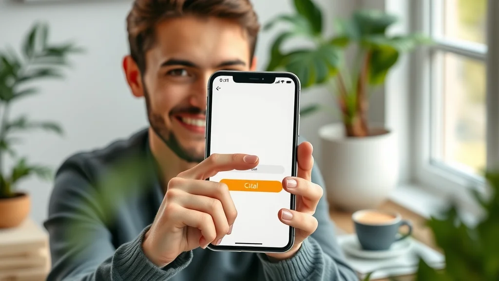
Short explainer: how mobile first web design generates leads for small businesses.
Conclusion
Long-term visibility and results for small businesses build through clear, consistent online presence. The easier you are to understand, the more likely customers are to reach out—leading to more leads and greater success over time.
If you’re ready to take your mobile-first strategy to the next level, consider how structured content publishing can amplify your results. By leveraging the Local Authority Content System™, you can implement advanced content strategies that not only enhance your website’s usability but also build long-term authority and trust in your market. Dive deeper into proven frameworks for local business growth and discover how a strategic approach to content can set you apart from the competition.


Write A Comment