


Ever wondered why your website gets visitors, but you rarely see inquiries or contact forms filled out? The answer may surprise you—it’s not just about how many people land on your site, but how your website guides, informs, and compels those visitors to take action. This article explores the real reasons behind a quiet inbox despite an active analytics tool, revealing how small improvements in web design and clarity can transform casual browsing into meaningful leads.
What You'll Learn in This Guide to Why No One Contacts My Website
- The real reasons behind website traffic without conversions
- Visitor psychology, attention spans, and online decision-making
- How mobile-first and one-page web design improves lead generation
- Clear steps to improve website conversion rates and contact inquiries
Opening Question: Why No One Contacts My Website Despite Website Traffic?
"If you get visitors but don’t get inquiries, leads, or sales, what is the missing piece?"

Understanding Website Traffic Versus Real Conversion
Defining Website Traffic and Its Limitations
Website traffic refers to the total number of visits your site receives, tracked with tools like Google Analytics. For business owners, seeing steady website traffic can feel reassuring—perhaps even like success. But the real measurement of an effective website is not just how many people are visiting your website, but whether those visits lead to contacts, phone calls, inquiries, or sales. Many businesses experience a gap: people land on their website from social media or search engines, read a blog post, maybe glance through their products and services, and then leave without getting in touch. This is because traffic alone is not enough to drive your business forward.
High website traffic can be misleading. While it may suggest strong online presence or solid standing in local searches, it doesn’t guarantee action. A business owner might notice hundreds or thousands of visits, but if only a handful result in a completed contact form or a phone number dialed, the site is not truly performing its job. Web design and user experience play pivotal roles in whether those anonymous website visitors ever engage beyond their first glance. Recognizing that the goal is conversion—turning visitors into potential customers—helps shift your focus from vanity metrics to real results.
Understanding the difference between attracting visitors and actually converting them is crucial. For a deeper dive into how structured content and authority-building can further enhance your website’s effectiveness, you might find the Structured Local Authority Publishing approach especially insightful, as it outlines tactical steps to position your business as a trusted local resource.
Conversion: What It Means for Website Traffic and Business Results
Conversion is the process of moving someone from casual visitor to participating customer. This could mean filling out a contact form, making a call, booking an appointment, or purchasing your products and services. For small businesses, especially in competitive fields like home services, local restaurants, or medical providers, conversion is the difference between website traffic that hovers in the background and tangible business growth. Achieving good conversion rates requires web design that both attracts attention and guides a visitor effortlessly toward taking a clear next step.
A successful website is not judged by the number of people landing on it, but by how many take action. Conversion-focused web design means prioritizing clarity, minimizing distraction, and providing straightforward calls-to-action. If people are leaving your website after only a few seconds or a quick scan, it’s not always a sign of poor service—it often signals that your website does not make it easy, obvious, or compelling to reach out. Digital marketing strategies, from blog posts to social media campaigns, should funnel visitors not just to your homepage, but toward a defined, visible outcome.
How Visitors Actually Behave When Visiting Your Website
Scanning, Scrolling & Snap Judgments: The Digital Marketing Reality
Modern web users rarely read every word. Instead, they scan, scroll, compare, and make snap decisions about which site or business to trust. Studies and web developers alike point out that the average attention span for online browsing is around eight seconds. When people land on your site—often after comparing several options in the same search results—they decide within a few eye movements whether what you offer is relevant. Visitors care about how easily they can understand what you do, how quickly they spot a phone number or contact form, and whether your business feels trustworthy based on first impressions alone.
Scrolling is now the natural way people interact with most websites, especially on mobile devices. Very few visitors click deeply through multi-page, complex navigation structures—in fact, the need to click repeatedly is a proven cause for drop-off in leads. Digital marketing best practices now focus on delivering all the necessary information, trust signals, and calls-to-action in a format that’s easy to scan in a single, continuous journey down the page. If your site forces potential customers to hunt for details or leads them into confusing navigation paths, they’re much more likely to close the tab and choose a simpler option elsewhere.

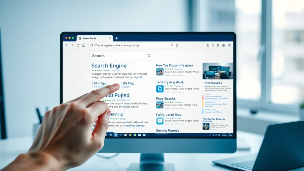
First Impressions Happen Instantly: Search Results and Website Traffic
The first eight seconds after a user lands on your page are critical. Research and professional experience alike confirm that visitors rarely read through entire blog posts or service descriptions before forming an opinion. Instead, their first impression comes from what they see immediately: your site’s headline, the clarity of your offer, trust signals such as testimonials or contact information, and the overall quality of your website design. With most visitors coming from search engine results, they compare your homepage with several others almost simultaneously—sometimes with multiple tabs open or within the same browser window.
This rapid-fire comparison puts significant pressure on small businesses to present their value proposition clearly, concisely, and above the fold. The majority of visitors will not scroll down if your site confuses or overwhelms them up front. If a business owner’s website is visually cluttered or ambiguous, the visitor simply clicks the back button and continues down the list of search results. First impressions in digital marketing are not about having the fanciest graphics or longest page—they’re about clarity, relevance, and an immediate sense of trust.
Mobile Browsing: Why No One Contacts My Website if it Isn’t Mobile-First
Mobile browsing is now the default for most users, whether they’re searching for a nearby restaurant, booking a local service, or reading a blog post about home improvement. If your website isn’t designed to perform optimally on mobile devices—meaning it loads quickly, displays content clearly, and provides large, tap-friendly buttons for calls-to-action—you’re losing a significant segment of potential customers. Search engines consider mobile optimization a key ranking factor, and visitors will abandon sites that feel outdated or clumsy on their smartphones.
A mobile-first approach recognizes that users scroll with their thumb, expect information without clicking through menus, and prefer to see a visible phone number or contact form within moments of landing on your page. Navigation must be streamlined, messaging condensed, and every action reduced to as few steps as possible. If a potential customer cannot quickly find what they need while on the go, your website’s traffic will translate to little more than missed opportunities.
Why Website Traffic Doesn't Automatically Generate Contacts or Leads
The Power of Clarity: How a Business Owner Can Guide Website Traffic
For any business owner, it is crucial to understand that almost all website traffic needs clear, simple guidance to turn into actual leads. When a visitor lands on your site, they look for an instant, easily understood summary of what your business does and how to take the next step—whether that’s booking, calling, or submitting a contact form. If your homepage is packed with jargon, excessive information, or lacks a clear call to action, even the most well-meaning customer may leave confused.
Web developers who specialize in lead generation web design focus on creating concise, prominent messaging at the very top of the homepage. This approach removes points of friction and makes the choice to contact you both logical and instant. When your website design matches how customers actually browse—fast, visually, and with scanning patterns—conversion rates grow naturally.
Issues in Navigation: How Web Developer Choices Impact Contact Rates
Navigation can either be a powerful guide or a major hurdle. Overly complex menus, drop-downs, or multi-level page structures often frustrate visitors, causing them to leave before taking action. A visitor who must click through several sections just to find your phone number, see your hours, or understand your services is unlikely to become a customer. Simple navigation, such as the one-page website model, minimizes these issues by allowing all vital information to be accessed through scrolling rather than clicks.
Many web developers and designers were trained in an era where deep, multi-layered websites were the norm. Today, user experience research and digital marketing practices show that minimizing barriers is key to conversion. If your site navigation makes visitors think too hard or click too often, you’ll routinely lose potential customers—regardless of how much website traffic you have.

Too Many Clicks, Not Enough Action: Conversion Loss in Digital Marketing
Every extra click is a chance for a visitor to drop off before converting. Traditional websites with separate pages for every service or step force users to interrupt their journey and reconsider their level of interest. In practice, most people landing on your homepage today prefer a simple, clear, one-page layout where they can get answers, build trust, and act—all without hunting for links or enduring multiple transitions.
Digital marketing experts know that too many choices often lead to decision fatigue. The more hurdles between a visitor and your contact form or phone number, the greater the likelihood of abandonment. Modern, conversion-focused web design aims to make the next step feel like the only logical thing to do. The process should be so clear that visitors move seamlessly from awareness to action, fueled by visible buttons, clear copy, and a direct message.
Website Traffic Alone Isn’t Enough: The Lead Generation Reality
Many small business owners invest years and money into building beautiful, content-rich websites, yet still struggle to generate viable leads or phone calls. The main reason? Website traffic alone is not a substitute for intentional, conversion-centric design. A high number of visitors means nothing if nobody contacts you, books, or buys. Having the right mix of engaging content, simple navigation, and smart structure is what sets apart businesses that turn visitors into customers from those that simply gather online dust.
The real goal of your online presence is lead generation—meaning your site must actively drive users toward getting in touch or making a choice, not just providing information or blog posts. Relying on organic search or social media to send traffic won’t build your business unless your web design and calls-to-action are in harmony with how customers behave today.
Visitors Compare, Scan, and Choose: Competing in the Search Engine Landscape
How Search Results Frame Visitor Expectations
When potential customers search for a product or service, search engines present them with a series of choices—often on the same screen and within seconds. Search results frame every visitor’s expectations: users will open several business websites at once, quickly assess which one makes the most sense, and typically contact the first one that feels like a good fit. If your message, trust signals, and next steps are clear up front, your business stands a better chance of being chosen over equally competent competitors.
This dynamic means small businesses are not just competing on service quality, but on how well their website sets the stage. Are you presenting your offer with clarity and confidence? Can a visitor answer “what does this business do?” after a single scan? The right website structure and content positioning can elevate your ranking in search results and raise your chances of getting contacted.
Clarity and Simplicity vs. Complex Website Design
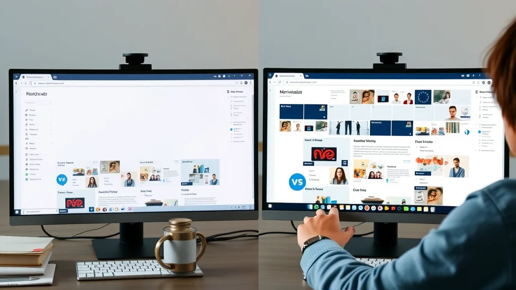
Clarity is a business advantage. A minimalist, well-structured site that communicates what you offer, who it’s for, and how a visitor should proceed is consistently more effective than an elaborate, multi-page site with complex navigation and cluttered visuals. Research from web designers and digital marketing strategists across industries confirms: simplicity and direct messaging drive action.
Compare the experience of landing on a one-page, mobile-first website with a clear call-to-action, versus a cluttered site with multiple menus, mixed messages, and buried contact details. The former offers a frictionless journey where next steps are obvious. The latter distracts and overwhelms, reducing the likelihood of conversion. As a result, clarity isn’t just about aesthetics—it’s a core factor in turning website traffic into real business.
Competing on Communication, Not Just Service Quality
People searching online do not read every word or compare every option in detail—they prefer to choose the business that is clearest, fastest to explain its value, and easiest to contact. Even if your products and services outperform competitors', your website must communicate that benefit in under eight seconds to win attention. First impressions happen before a word is read—based on layout, headline, trust cues, and accessibility.
Clear communication bridges the gap between your business and potential customers on both desktop and mobile platforms. Websites that allow visitors to understand their offer and next steps quickly will always outperform less focused, more complicated rivals in search engine results—and in real-world contact rates.
Critical Website Mistakes That Drive Visitors Away
- Unclear messaging about what the business offers
- Complicated navigation structures
- No visible or clear calls-to-action
- Slow page speed deterring website traffic
- Lack of mobile optimization hurting search engine rankings
Lead Generation Web Design: The Solution to Why No One Contacts My Website
How One-Page Website Structures Reduce Friction
One-page websites have become the new standard for lead generation web design. By consolidating all essential details—what you do, why you’re trustworthy, how to get in touch, social media links, and reviews—onto a single, scrollable page, you create a seamless experience that matches how visitors naturally browse. This approach removes the friction caused by deep navigation trees or complex menu structures, reducing the number of clicks needed to contact you.
A single, continuous page lets you guide visitors through a logical sequence: headline, explanation, key benefits, proof, and then calls-to-action. This leads to improved conversion rates and a more focused message, ensuring a visitor who scrolls through your homepage is much more likely to become a lead than someone clicking between multiple pages. For busy business owners, this streamlined structure is not only easier to maintain but more effective with search engines and customers alike.
Clear Calls-to-Action: Turning Website Traffic into Leads
The best performing websites always feature a clear, prominent call-to-action—button, phone number, or contact form—visible almost immediately. A well-placed call-to-action doesn’t just “ask” for the lead; it guides the visitor’s next step, making it feel like a natural decision. This reduces hesitation and decision fatigue. Business owners who ensure their contact options stand out and aren’t buried at the bottom of the page see much higher conversion rates.
Calling attention to the intended action (call, book, email, schedule, buy) with color, spacing, and layout design is a proven digital marketing tactic. Every visitor should always know how to reach you within three seconds of landing on your website—across mobile and desktop. Competing businesses that hide their forms or mix them with unrelated content often lose out to those who prioritize user experience and visibility.
Simple, Direct Messaging for Instant Understanding
Simplicity wins. By using direct, conversational language—"We fix air conditioners," "Book a table," "Get a free quote today"—business owners can help every visitor immediately understand what they offer. Successful websites eliminate confusing jargon, overly technical explanations, or generic marketing fluff. Web design trends now favor strong headlines, short descriptive paragraphs, and bullet points over dense blocks of text.
Messaging clarity not only makes your business easy to understand for first-time visitors but also strengthens your standing in organic search results. Search engines reward clear, concise copy that matches user intent, improving your ranking factor and, over time, driving more qualified website traffic to your door.
Mobile-First Design: Meeting Visitors Where They Are
With the vast majority of searches now happening on mobile devices, a mobile-first web design is not optional—it’s essential. This means templates and layouts must be responsive, images optimized for fast loading, and text large enough for comfortable viewing on a small screen. Buttons and forms must be easy to tap, and navigation must feel totally natural.
Web developers committed to modern best practices ensure that every key step—from landing to conversion—can be completed smoothly with just a thumb movement. This approach not only improves the experience for your visitors but can also directly impact your search engine position. Google and other engines now use mobile performance as a ranking factor, giving preference to sites that serve mobile users efficiently.
Real-World Insights: Quotes on Why No One Contacts My Website
“People don’t read websites; they scan for what makes sense in the moment.” — Experienced Web Developer
“Your best chance to earn a customer is in the first 8 seconds after they land on your page.” – Digital Marketing Strategist
Website vs. Lead Flow: Why Many Business Owners Still Struggle
How Design Decisions Guide (or Deter) Search Engine Visitors
Design decisions—from headline size and image choices to call-to-action placement—directly impact whether someone decides to contact your business or move on. A business owner may have spent ten years building a reputation and online presence, but if their website design was not built around guiding the visitor’s next step, even loyal customers may hesitate to reach out. The site must deliver clear visual cues and a logical flow that mimics how people actually browse.
Small differences—such as using a contrasting button for contact forms or placing the phone number at the top—can significantly influence outcomes. Digital marketing experts know this leads to better engagement, more completed forms, and ultimately, increased lead flow for your business.
Traffic Without Conversion: Common Pitfalls Identified
Websites with impressive visitor counts can still fail to deliver actual inquiries. Common pitfalls include unclear offers, hidden or missing calls-to-action, overly complex navigation, or slow site performance. Too often, business owners blame their website platform or search engine ranking, when the real issue is a lack of alignment with how people want to browse. Recognizing these pitfalls and addressing them—through direct messaging, simplified layouts, and mobile-friendly design—can transform traffic into contacts.
Trust signals, such as testimonials, recognizable local affiliations, or easy-to-find contact information, also play a huge role. When potential customers feel uncertainty or see conflicting messages, they are much more likely to bounce—even if your website traffic is high.
Clarity and Trust: The Cornerstones of Online Engagement
The most successful websites foster trust by being clear, honest, and easy to navigate. Visitors seeking your products and services don’t want to spend time deciphering your site, navigating multiple pages, or searching for a way to contact you. Instead, they respond to straightforward language, consistent branding, and trust signals that confirm your legitimacy as a small business. When your website answers their questions before they even ask, you become their obvious choice.
Building trust is a process. Results improve over time as you maintain visibility and refine your site for better clarity and structure. Every improvement—however minor—can tip the scales in favor of more calls, booking requests, and genuine customer connections.

Table: Comparing Website Structures and Conversion Impact
| Website Structure | Messaging Clarity | Navigation Complexity | Conversion Rate Impact |
|---|---|---|---|
| Multi-page | Vague | High | Low |
| One-page | Clear | Low | High |
| Mobile-optimized | Direct | Minimal | High |
Checklist: Steps to Fix Why No One Contacts My Website
- Review homepage copy and simplify your offer
- Reduce unnecessary navigation and keep structure simple
- Add clear, prominent calls-to-action on every page
- Improve load speed and optimize for mobile browsing
- Test your website as a visitor and take notes on what is confusing

Key Takeaways: Turning Website Traffic Into Real Contacts
- Clarity and simplicity dramatically affect conversions
- Effective websites make next steps obvious without extra clicks
- Consistent visibility and improvements build trust over time
- Mobile-first, one-page design is crucial for modern lead generation
FAQs: Why No One Contacts My Website and Related Topics
Why is no one visiting my website?
If your website receives little to no traffic, it may be due to limited visibility in search engine results, weak presence on social media platforms, or content that does not match what local searches are seeking. Building online presence takes time. Focus on optimizing your website for relevant keywords, sharing engaging content, maintaining active social media accounts, and ensuring your site structure supports organic search rankings. Over time, consistent effort usually leads to increased website traffic and more people visiting your website.
What are the 7 C's of a website?
The “7 C’s” of a website are: Clarity, Consistency, Credibility, Convenience, Content, Communication, and Creativity. Clarity ensures visitors easily understand your business offer. Consistency in branding and messaging builds recognition. Credibility is shown through trust signals and accurate information. Convenience means a simple, streamlined user experience. Content should be relevant and fresh—such as blog posts or service pages. Communication focuses on easy, two-way contact options. Creativity helps your business stand out and feel approachable.
How do I attract traffic to my website?
To attract more website traffic, focus on optimizing your pages for search engines (SEO), sharing regular updates and news via blog posts, and promoting your business on social media. Engaging content, strong local keywords, and consistent online presence all lead to higher visibility. Don’t forget: website speed, clarity, and mobile optimization also contribute to your ranking factor and affect how often potential customers visit your site.
Why are people not buying from my website?
If people are visiting your website but not buying or contacting you, it could be due to confusing navigation, unclear offers, slow load times, missing trust signals, or a lack of clear calls-to-action. Modern customers scan for instant answers and expect a direct, smooth path from landing on your homepage to reaching your contact form or purchase area. Regularly test your site, focus on clarity, and remove any barriers. Small improvements can make a big difference in conversion rates and customer satisfaction.
Video covering key reasons why website visitors do not convert into contacts or leads, with animated graphics showing visitor behavior, conversion funnels, and before/after examples of website changes.
Final Thoughts: Visibility, Consistency, and Clear Websites Win
Ultimately, building a website that generates real contacts is about creating clarity, reducing friction, and meeting visitors where they are. Visibility and trust grow with consistency and continual improvement. The businesses that communicate simply and make next steps obvious are the ones most likely to win new customers.
If you’re ready to take your website’s performance to the next level, consider exploring broader strategies that go beyond design tweaks. The Local Authority Content System™ Insights & Strategy offers a comprehensive framework for building lasting authority and trust in your market. By integrating structured publishing and strategic content, you can amplify your visibility, strengthen your reputation, and create a sustainable flow of qualified leads. Dive deeper into these advanced methods to unlock the full potential of your online presence and set your business apart in a crowded digital landscape.
Discover How Lead Generation Websites Work and Boost Your Contact Rates
Ready to explore how lead generation website design can improve your business’s results and increase contact inquiries? Learn how lead generation websites work and see practical examples tailored for local businesses.


Write A Comment