


Imagine two local businesses side by side. Both promise excellent service, but their websites couldn’t be more different. One is built with the smallest budget possible, crammed with clutter, and hard to use on a phone. The other is streamlined, clear, and easy to navigate even on the smallest screens. Both may get visitors, but only one reliably turns those visitors into new customers. The way a business website is built can be the difference between getting attention online—and being overlooked in seconds.
Observing the Online Race: First Impressions and the Role of Website Design
In today's fast-paced digital world, the battle between a cheap website vs high converting website is played out millions of times every day. Every business owner, whether running a restaurant, home service, or medical practice, faces the same challenge: making an immediate positive impact online. First impressions are often made within the first 3 to 5 seconds of landing on a page. People rarely read line by line; instead, they scan, scroll, and form judgments almost instantly based on what appears above the fold—the first part of the website they see. If the site feels cluttered, slow, or outdated, visitors move on just as quickly.
Website design is not just about how a site looks, but how it works for the user. A high converting website leverages easy-to-follow structure, clear visual cues, and intuitive flow, making it simple for users to understand what a business offers. In contrast, cheap web designs often prioritize cost over clarity, sacrificing usability and conversion rate in the process. Businesses that put emphasis on professional web design not only stand out more, but guide users toward meaningful actions—calls, bookings, or purchases—turning fleeting visits into business results.

How Customer Behaviors Shape Website Outcomes
Customer behavior online has evolved. With an average attention span close to eight seconds, visitors no longer patiently sift through pages. Instead, they arrive at a website, scan for quick answers, and only stay if it's immediately clear what they're supposed to do. Small businesses competing for leads must recognize this shift in online habits. A cheap website, lacking structure and clarity, often leads to higher bounce rates—people leaving without taking any action. High converting websites, on the other hand, are structured to guide these scanning visitors directly to what matters: the services, the offer, and the next step.
User experience is shaped by modern web design trends like clear calls-to-action, simplified navigation, and content formatted for scrolling (not clicking). When websites are built with user habits in mind, they not only hold a visitor’s attention longer but also nurture trust. The easier it is for visitors to get quick answers and act, the more likely they are to reach out, resulting in more leads for the business. Simply put, the way customers behave online determines the design elements that separate a cheap web from a high converting solution.
For businesses looking to further refine their approach, understanding the principles of structured local authority publishing can provide tactical insights into organizing content and design for maximum impact. This method emphasizes clarity and authority, which are essential for converting website visitors into loyal customers.
The Power of First Impressions: Cheap Website vs High Converting Website
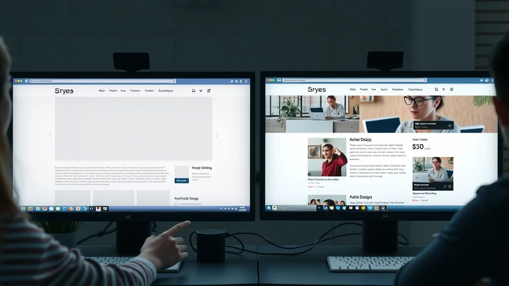
First impressions are powerful, especially online. A cheap website often appears cluttered, outdated, or generic. Such sites may have slow load times or confusing navigation that causes visitors to leave almost as soon as they arrive. The bounce rate rises with every additional second it takes for a user to find value. In comparison, a high converting website presents a strong, polished image right away. The branding is clear, messaging is direct, and every element is designed to build trust.
This clarity doesn't just come from beautiful visuals, but from a deep understanding of what visitors need in their first moments on the page: who you are, what you do, and how to engage. Cheap websites rarely provide that experience. Instead, they make users work to find answers, which leads to confusion and lost opportunities. High converting websites deliver immediate value—one glance is often all it takes for visitors to know they've found the right place.
Scanning, Scrolling, and Comparing: Modern User Habits
People don’t meticulously read websites anymore—they scan. Scrolling is now the default way people interact with digital content. Instead of clicking through page after page, users instinctively move down a single, longer page. Cheap websites that force users to hunt through multiple pages or menus put obstacles in their path, leading to frustration and lost interest. Every additional click is a point where visitors may abandon the journey.
Today’s online shopper, patient or customer often has multiple tabs open, comparing businesses within the same search. They’ll reach out first to the business whose offer is easiest to understand, whose value is clear, and whose website guides them smoothly to contact or purchase. The secret to outpacing the competition is matching the site’s structure to these modern browsing habits (scrolling, scanning, fast comparing). Cheap sites built without these principles often fall behind.
What You’ll Learn About Cheap Website vs High Converting Website
- Understand the real differences between a cheap website and a high converting website
- Learn how user behavior and browsing patterns impact business results
- Gain insights into strategies that help small businesses generate more leads online
- Discover web design principles that affect conversion rate and website effectiveness
Cheap Web Designs: Simplicity or Sacrifice?
What Makes a Website Cheap vs High Converting?
There is a clear divide between cheap websites and high converting websites, and it’s not only about budget. A cheap website commonly uses a pre-made template, crowded layouts, and minimal customization. They may look “good enough” on the surface, but under the hood, they often lack the structure that guides users to take action. These sites are built with the goal of saving on cost, sometimes at the expense of usability, mobile compatibility, or calls-to-action.
High converting websites, in contrast, place the experience of the visitor at the center of every decision. They feature clear messaging, uncluttered design, seamless flow from top to bottom, and visible points for the visitor to reach out. Conversion rate optimization is built in from the start. Every aspect—from headline to contact form—is designed to answer questions quickly and move visitors toward becoming a customer. The difference is not in the appearance alone, but in how the design anticipates and supports the behaviors of real users.
The Cost of Cut Corners vs the Benefit of Clarifying Conversion
Cutting corners to achieve a cheap website usually means sacrificing features that prevent friction in the visitor’s journey. These include slow page speeds, poor mobile support, or ambiguous navigation. The real cost of these sacrifices appears over time: fewer inquiries, lower conversion rates, and higher bounce rates. Cheap sites may draw visitors, but can frustrate them into leaving before taking action.
Investing in clarity makes a difference that is measurable. Using professional web design techniques—such as concise messaging, easy navigation, and clear calls-to-action—removes barriers for visitors and results in a steady flow of leads. Businesses aiming for results realize that a high converting site isn't simply a bigger expense; it’s a strategic investment that influences how many customers choose them from the online crowd. Rather than focusing on saving upfront, wise owners focus on building trust and lowering resistance through effective, conversion-friendly design.
Common Pitfalls in Cheap Websites That Hurt Conversion Rate
Cheap websites often share a few common issues that decrease their conversion rate. The most frequent problems include slow load times, especially when images are not optimized or scripts are poorly managed. A site that takes more than a few seconds to load on mobile or desktop leads to high bounce rates—visitors won’t wait, they'll simply choose a competing business whose site appears instantly. Another persistent problem is poor user experience due to confusing layouts or difficult navigation. When new visitors struggle to find information, understand the offer, or contact the business, they move on without hesitation.
Missing or unclear calls-to-action top the list for lost leads. Many cheap web designs fail to make it obvious to users what action they should take next, whether it's calling, booking, or leaving an inquiry. On top of this, a lack of professional web design elements (like modern fonts, enough spacing, and quality visuals) can suggest that a business hasn’t invested in itself, unintentionally undermining trust. When small businesses cut corners in web development, they often pay the price through missed opportunities to convert valuable website traffic into real customers.
Comparative Table: Cheap Website vs High Converting Website Features
| Feature | Cheap Website | High Converting Website |
|---|---|---|
| Web Design Structure | Basic, template-based; lacks focus | Custom, user-centered; organized for conversion |
| Conversion Rates | Low; few inquiries or sales | High; turns visitors into leads and customers |
| User Experience | Confusing, cluttered, or outdated | Simple, clear, and intuitive |
| Mobile Optimization | Often neglected; not fully responsive | Mobile-first; seamless on all devices |
| Visual Clarity | Bland, generic, lacks branding | Professional, visually stunning, on-brand |
Conversion: What It Means and Why It Matters to Every Small Business
Defining Conversion Rate for Small Business Success
Conversion means making something happen—from a visitor calling your store or booking a service, to submitting a contact form for more information. The conversion rate is the percentage of visitors who complete a desired action. For a small business, this action could be a phone call, a message, a booking, or a purchase. The purpose of any business website, no matter the industry, is to drive these actions. High converting websites are built specifically to guide people toward these outcomes, reducing confusion and making the next steps obvious.
A high conversion rate isn’t achieved by accident. It’s the result of careful planning, clear structure, and well-placed calls-to-action. Cheap websites, while often less expensive upfront, usually lack these features, leading to fewer inquiries despite similar traffic levels. The choice between a cheap website and a high converting website is ultimately a decision to invest in consistent results. In the age of short attention spans and quick decisions, meeting visitor expectations right away translates directly into more leads and customers.
From Clicks to Customers: The Difference a Professional Website Makes
Many small businesses mistakenly believe that simply having a website is enough to attract customers. However, the experience provided by the site determines how many of those visitors actually become leads. A high converting website, guided by effective web design, shepherds users from interest to inquiry smoothly and confidently. This means that visitors who land on the page can see right away what the business does, understand the value, and identify exactly what to do next.
A professional website is more than just an online pamphlet. It’s a lead-generating tool—one engineered to convert. In contrast, a cheap site may look similar to dozens of competitors, offer little guidance, and miss out on opportunities to build trust. Even with similar visitor numbers, the site that is easier to use, quicker to load, and clearer in its message will outpace the competition in generating new business.

How Professional Web Design Supports Higher Conversion Rates
Professional web design is all about anticipating and guiding visitor behavior. High converting websites embrace simplicity, ensuring that the most important message, offer, and call-to-action are visible immediately. Rather than distracting or overwhelming visitors with lots of options, complex navigation, or dense information, these sites use clean layouts and focused content. This builds trust and reduces the time required for a visitor to make a decision, directly boosting conversion rates.
Key design choices—like mobile-friendly layouts, prominent calls-to-action, and fast load times—all add up to a user experience that feels effortless. Modern web design recognizes that every second matters and every click should have a purpose. When business owners invest in professional web strategy, they’re investing in a website that does more than just exist—it guides, convinces, and converts.
Website Structure: The Impact of One-Page vs Complex Navigation
Why Simple Structures Outperform Many-Page Cheap Websites
A common misconception is that more pages equal a better website. In reality, simpler structures often work best. One-page websites, for instance, turn long scrolls into a cohesive story, helping visitors see all key information without endless clicking. Because scrolling is more natural for users than clicking back and forth through menus, one-page structures reduce friction and keep attention focused on the business's core message.
Cheap websites often have poor navigation or scattered content, meaning users may never find what they're looking for. It only takes a few seconds of frustration for visitors to leave and find another business with a simpler, easier-to-follow site. Streamlined structures help visitors understand the business quickly and take action without obstacles.
Effects of Navigation Complexity on Conversion Rates
Navigation complexity can be a major conversion killer. When a website asks users to click through multiple menus, tabs, or buried pages to learn about services, the likelihood of losing those users increases. Every extra click adds friction. Complex navigation not only confuses new visitors but also increases bounce rates, especially on mobile devices, where menu structures can be harder to use.
High converting websites keep things streamlined and logical. They present information in the order users expect, with easy pathways to contact forms, phone numbers, and service details. The goal is to avoid making users think too hard or search too long for what they need—every step should feel intuitive and lead naturally to the next.
The Case for Clear Calls-to-Action in High Converting Website Design
Every high converting website features clear, visible calls-to-action (CTAs). These are the buttons or links that say, "Book now," "Call today," or "Request info. " Cheap websites often hide their CTAs, bury them at the bottom of a page, or use unclear language. This reduces the conversion rate, simply because visitors don’t know what to do next.
On a well-designed site, CTAs are impossible to miss. They’re right at the top, repeated throughout the page, and written in direct, simple language. By confidently guiding visitors, CTAs turn passive readers into active leads. For small businesses wanting more phone calls or appointments, elevating the placement and clarity of their calls-to-action is one of the highest-impact steps they can take.
Mobile-First in Modern Web Design: Matching How People Browse

Why Mobile-Optimized Websites Lead to Better Results
More than half of web searches now start on mobile devices. This shift means that every website must be built with mobile users in mind. Cheap websites, often optimized only for desktop screens, become awkward and hard to use on phones or tablets. Buttons may be hard to press, text may be too small, or images might not load properly. These small errors have a big impact: if the site isn’t easy to navigate with a thumb or doesn't load in seconds, mobile visitors will move on.
Mobile-first web design adapts every element—from font size to menu structure—to the screens people use most. By providing a streamlined, fast, visually stunning experience on any device, high converting websites keep engagement high and bounce rates low. Prioritizing mobile optimization is no longer optional; it’s a basic requirement for any business looking to compete online today.
Examples: Cheap Web vs Visually Stunning and Responsive Websites
Picture two websites for a local restaurant. The cheap web version squeezes tiny text onto the homepage, hides key info behind hard-to-use menus, and makes users pinch and zoom just to read the specials. On a high converting, visually stunning website, the location, hours, and reservation link are at the top—big, easy to tap, and formatted to fit small screens. Photos look crisp, and every section is accessible within a gentle scroll.
A similar pattern holds true for any business: medical practices, roofing companies, or local shops. Responsive design not only looks more professional but works fluidly, whether accessed from a laptop in the office or a phone on the go. This difference, though subtle, is what often wins over customers deciding between competing businesses—especially when all other things are equal.
Page Speed: How Waiting Costs You Potential Customers
Page load speed is a behind-the-scenes hero of high converting websites. If your website takes more than a few seconds to load, especially on mobile or slower connections, visitors often leave before they see any content. Cheap sites, especially those packed with unoptimized images or unnecessary plugins, tend to have slow load times that quietly inflate bounce rate and decrease overall conversion.
A site that loads quickly demonstrates professionalism and respect for the user’s time. Fast-loading pages not only keep visitors engaged but are favored by search engines as well—supporting better visibility online. For small businesses, speeding up a website can be the single change that delivers more inquiries from the same amount of traffic.
Lead Generation Web Design: Core Principles That Drive Results
Guiding Visitors: From Landing to Action Without Friction
The most successful business websites create a focused, low-friction experience from the moment a visitor lands on the page. Every section supports the next, leading seamlessly to a visible, enticing call-to-action. By eliminating extra steps and unnecessary distractions, high converting websites make the path from interest to inquiry incredibly straightforward.
Fewer clicks, more scrolling, straightforward language, and prominent CTAs combine to reduce hesitation and encourage action. Instead of thinking, “What do I do now?” visitors are nudged naturally towards calling, booking, or submitting a form. Each time the journey is simplified, conversion rates rise.
Clear Messaging: Helping Visitors Understand Your Offer
Your message must be instantly clear to new visitors. Cheap web designs often bury the value proposition in long paragraphs or confusing layouts, forcing people to hunt for the main offer. High converting websites get to the heart of what the business does within the first few lines. Visitors can see, in seconds, who you are, what you provide, and how they benefit.
When people understand the offer quickly, they are far less likely to leave—the website builds trust almost immediately. In a digital landscape where choice is endless, concise, clear messaging helps your business stand out and keeps visitors moving toward the next step.
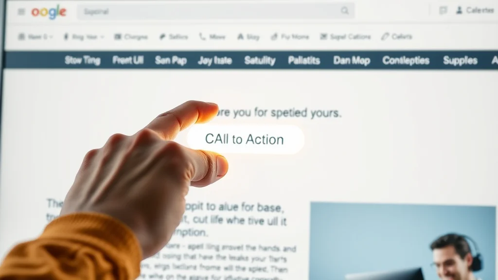
Strong Calls-to-Action: A Pillar of High Converting Websites
Calls-to-action are the catalyst that turn passive visitors into active leads. High converting sites treat CTAs as design anchors, placing them in clear sight at multiple points throughout the page. Cheap websites, by contrast, may have only a single, unremarkable button—often lost at the bottom of the page. Without strong CTAs, even the best service providers miss out on leads simply because the next step is unclear.
Effective CTAs use action words, contrasting colors, and clear placement. They align with user expectations ("Call Now," "Book Today," "Request Info") and are repeated with consistency. For small businesses competing for attention, these subtle design tactics make the all-important difference between a visit and a new customer.
How Small Businesses Compete Online Beyond Service Quality
The Role of Website Design in Customer Decisions
It’s easy to think that the quality of your product or service speaks for itself, but online, most visitors have no way to judge your expertise until after they’ve chosen you. Website design, therefore, becomes the first real 'test' prospects use to decide if you can be trusted. A well-designed, modern website builds trust in moments, while a cheap, outdated design can undo years of hard-earned reputation with a bad first impression.
In a typical online search, prospective customers will look at several businesses in rapid succession, spending just seconds on each page. The ones that win their attention and their inquiry are those whose websites feel familiar, easy, and frictionless. Clear design communicates competence—often more powerfully than any testimonial or review.
How Quick Clarity Determines Lead Flow
In online competition, speed is paramount. Customers rarely evaluate every business equally. They contact the businesses that make the clearest, strongest impression, fastest. A cheap website with unclear navigation or overloaded information will likely be bypassed, regardless of how exceptional the service might actually be.
When a website’s message is clear and the value is immediately understood, it gets more inquiries—period. Quick clarity keeps the lead flow steady, while confusion causes potential customers to bounce to the next option in their search results.
Comparing Businesses: The Fast-Paced Search Experience
Most online shoppers or clients do not spend time methodically reading about every local business. Instead, they compare multiple businesses rapidly, checking for obvious differences in professionalism, clarity, and ease of taking action. High converting websites answer these priorities directly, making the customer’s choice easy. When the alternative is a cheap site that requires effort just to find a phone number, the decision is nearly automatic.
This is why businesses that present their services, contact information, and value upfront consistently outperform those with basic, under-designed sites. In a world where every second counts, clarity and visibility are the keys to winning more business.
Common Reasons Businesses Lose Leads With Cheap Websites
- Unclear value proposition
- Difficult navigation or confusing website structure
- Slow load times and poor mobile experience
- Lack of visible, easy-to-use calls-to-action
- Outdated or unprofessional visual appearance
Visibility and Decision-Making: Connecting Website Clarity to Results
Clarity vs Confusion: How Trust is Built (or Lost) in Seconds
Trust is built or lost in the first few seconds of a website visit. Clutter, slow loading, and generic messaging breed confusion. For small businesses, this means lost leads, not because of the quality of their service, but because their website doesn’t communicate clearly. On the other hand, clarity in design, message, and structure gives visitors the confidence to reach out. Clear, purpose-driven sites guide users quickly, removing second-guessing and making the decision to act easy.
Making a strong impression online is less about fancy graphics and more about straightforward, accessible communication. The clearer the website, the more likely visitors are to trust and engage with a business.
The Link Between Website Structure and Lead Opportunity
A website’s structure is a silent sales tool. Simple, logical flows retain more visitors and trigger more inquiries. When structure is cluttered, hard to navigate, or overloaded with irrelevant details, users abandon their journey. High converting websites are engineered to minimize distractions, showcase the business’s offer immediately, and keep calls-to-action in constant view. Every improvement in structure opens the doors to more leads.
Leads aren’t lost because customers stop caring—they’re lost because the website fails to help them make a choice quickly. Businesses that invest in clarity, speed, and ease of use maximize the potential of every website visit.
Expert Perspectives: Quotes on Cheap Website vs High Converting Website
"A cheap website may look like a bargain, but a high converting website is an investment that returns leads."
"The difference between being seen and being chosen is often as simple as the clarity of your message."
People Also Ask: Cheap Website vs High Converting Website
What are the main differences between a cheap website and a high converting website?
A cheap website usually prioritizes cost savings over user experience, with basic layouts, minimal optimization, and few conversion-focused features. A high converting website, on the other hand, uses professional web design, clear messaging, mobile-first structure, and persuasive calls-to-action to guide visitors toward taking action. These differences directly affect how many leads a site will generate.
How does website design impact conversion rate for small businesses?
Website design shapes the visitor journey. A well-designed, high converting website uses simple structure, clear navigation, quick load times, and strong calls-to-action, all of which increase the likelihood that a visitor will become a customer. Poor web design creates confusion and causes visitors to leave before acting.
Can a cheap website generate the same number of leads as a professional website?
While a cheap website may bring in some leads, it rarely matches the performance of a professional website. Professional web design addresses user habits, provides clarity, and reduces friction in the customer journey, all of which support higher conversion rates.
Why do most website visitors leave without taking action?
Most visitors leave because they cannot quickly find what they need, the site is difficult to navigate, or the message is unclear. Modern visitors have short attention spans and need a website that immediately answers their questions and guides them to the next step. Clarity and simplicity are crucial.
Answer: What are the main differences between a cheap website and a high converting website?
A cheap website usually prioritizes cost savings over user experience, with basic layouts, minimal optimization, and few conversion-focused features. A high converting website, on the other hand, uses professional web design, clear messaging, mobile-first structure, and persuasive calls-to-action to guide visitors toward taking action. These differences directly affect how many leads a site will generate.
Answer: How does website design impact conversion rate for small businesses?
Website design shapes the visitor journey. A well-designed, high converting website uses simple structure, clear navigation, quick load times, and strong calls-to-action, all of which increase the likelihood that a visitor will become a customer. Poor web design creates confusion and causes visitors to leave before acting.
Answer: Can a cheap website generate the same number of leads as a professional website?
While a cheap website may bring in some leads, it rarely matches the performance of a professional website. Professional web design addresses user habits, provides clarity, and reduces friction in the customer journey, all of which support higher conversion rates.
Answer: Why do most website visitors leave without taking action?
Most visitors leave because they cannot quickly find what they need, the site is difficult to navigate, or the message is unclear. Modern visitors have short attention spans and need a website that immediately answers their questions and guides them to the next step. Clarity and simplicity are crucial.
Watch real user sessions: one struggles and quickly bounces from a cheap, cluttered site; the other enjoys a seamless, efficient journey on a high converting website.
Lists: Key Features of High Converting Websites
- Mobile-optimized and fast
- Single-page or simple structure
- Clear calls-to-action
- Professional and visually stunning design
- Content matched to user behavior
- Easy navigation with minimal clicks
- Visible contact and inquiry options
FAQs: Cheap Website vs High Converting Website
Is a one-page website better for lead generation?
Yes, one-page websites often perform better for lead generation because they reduce friction by allowing visitors to scroll naturally and see all essential information in one place. Fewer clicks mean visitors stay longer and are guided smoothly toward clear calls-to-action, increasing the chance of conversion.
How quickly do visitors form an opinion of a business website?
Visitors form opinions almost instantly—usually within the first few seconds of landing on a site. Their decision to stay or leave is based on visual clarity, ease of navigation, and whether they immediately understand the business’s value. Fast, positive first impressions are key to online success.
Does mobile optimization really make a difference?
Absolutely. With most users visiting websites from smartphones, a site that isn’t mobile-optimized will lose visitors quickly. Mobile optimization ensures text is readable, buttons are easy to tap, and the user experience is smooth, leading to higher engagement and more inquiries.
Key Takeaways: Cheap Website vs High Converting Website
- Cheap websites may save on upfront cost but often underperform in lead generation
- A high converting website focuses on usability, clarity, and guiding user actions
- Mobile-first and simple structures match modern browsing habits
- Clarity in message and structure is essential for turning visitors into customers
- Small improvements can lead to significant growth in leads and customer engagement
Consistency, Clarity, and Lead Generation: Final Thoughts on Choosing Your Website Strategy
Improving your website’s clarity, speed, and structure is an investment that steadily builds trust, leads, and long-term business growth. Businesses that deliver a clear, easy-to-understand experience are remembered and chosen more often by today’s fast-paced online audience.
Explore How Lead Generation Websites Work
Curious how a high converting website could transform your business results? Learn how lead generation websites work and discover real-world case studies.
See the process of designing and building a website that’s intentionally crafted for clarity, conversion, and real business results.
If you’re ready to move beyond the basics and want to elevate your entire digital presence, consider exploring the broader strategies behind content authority and structured publishing. By adopting a systemized approach to your website and content, you can position your business as a trusted leader in your local market. Discover how the Local Authority Content System™ empowers businesses to build credibility, drive engagement, and achieve sustainable growth online. Take the next step and see how strategic content and design can work together to deliver results that go far beyond a simple website upgrade.


Write A Comment