


Imagine you’re searching for an urgent solution—a plumber for a burst pipe, a clinic for sudden illness, or a locksmith for a late-night emergency. You land on a website and within seconds, you’ve already decided whether to stay or keep searching. This is the reality for every emergency service business online: how your website looks and works shapes whether customers call or click away, often in less than 8 seconds.
First Impressions: The Immediate Impact of Emergency Service Website Design
- How quickly users form opinions about emergency service website design: Research and everyday experience confirm that visitors decide in a matter of seconds if a website meets their needs. This is especially true for emergency service websites, where a quick judgment can mean the difference between gaining a call or being dismissed. A site’s appearance, structure, and message are absorbed almost instantly—before a single line is read in detail.

- Observation: Emergency website visitors rarely read every word. Instead, users tend to scan for key signs of reliability, such as visible contact information, a clear service summary, and easy navigation. Most will scroll swiftly looking for a call-to-action, not engage in deep reading.
- Role of attention spans and scanning in site alert effectiveness: Because attention spans are short—around 8 seconds on average—strategically placed alert components and messaging must grab attention immediately. A well-placed site alert or clear call-to-action ensures emergency service offers are not missed amid fast-paced browsing.
"Most visitors decide within seconds if a website meets their needs, especially on emergency websites for service businesses."
Understanding User Behavior on Emergency Service Websites
- Mobile browsing habits: Today’s users are most likely to discover emergency services through their smartphones. As a result, mobile-first website design is no longer optional—it’s vital. Browsers expect fast-loading, responsive pages with big, touch-friendly buttons and clear headlines. A mobile-optimized emergency service website design puts help within immediate reach, guiding visitors to make a call or submit a booking in just a few taps.
- Preference for scrolling over clicking: Most website visitors naturally scroll rather than click through menus and multiple pages, especially in stressful emergency situations. Keeping content on a single, well-organized page respects this behavior and reduces friction. Fewer clicks mean fewer chances for a visitor to abandon the process.
- How complex navigation and multiple clicks hurt conversions: Each additional click, dropdown, or page load adds confusion and slows users down. In emergency situations, complexity can stop a potential customer from taking action—resulting in lost calls, bookings, or leads. A straightforward design structure focusing on scrollable sections and strong alert components directly supports better conversion rates.
For those looking to further streamline their emergency service website and maximize lead generation, exploring structured publishing strategies can provide a tactical edge. Implementing a structured local authority publishing approach helps ensure your content is organized for both user clarity and search engine visibility, supporting higher conversion rates.
Conversion Defined: Turning Emergency Website Visits Into Customer Action
- What qualifies as a conversion on an emergency service website: Conversions are not just about visitors but about action—calls placed, booking forms submitted, contact info shared, or inquiries made through the site. Every emergency service business, from fire departments and clinics to home service providers, relies on these actions to generate and serve new customers.
- Examples: Calls, appointment bookings, and online inquiries are the typical desired outcomes for emergency service websites. A click-to-call button, integrated contact forms, and immediate booking tools are essential for facilitating these conversions and tracking lead flow.
- Why lead flow is more important than traffic for emergency services: Attracting high volumes of visitors does not guarantee business. The flow from visitor to lead—enabled by clear calls-to-action, alert components, and frictionless design—is what truly matters. A website designed for conversion actively guides users to act, not just browse.
"A website isn’t just for information—it needs to actively guide users to take the next step."
How Emergency Service Website Design Can Lose—or Gain—Customers
- The risk of unclear messaging: Visitors who don’t immediately understand what your emergency service website offers will move on. Short attention spans demand concise, direct summaries and service highlights. Ambiguous taglines or hidden service areas often cause confusion and lost leads.
- Difficult navigation loses visitors quickly: Overwhelming menus, unclear categories, or too many choices can prompt visitors to click away. The quicker a user can find a short alert message and be presented with next steps, the higher the chances they will call or complete a form.
- Mismatch between site design and real browsing behavior: Many emergency websites are still structured like traditional, multi-level sites. This ignores that most users scroll, not click, and expect critical information up front followed by context and followup only as needed. A structure echoing actual behavior leads to better conversions and less frustration.

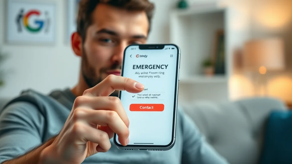
- How to use strong site alert components to guide users: An alert component placed at the top or as a floating action button ensures critical information—like emergency contact numbers or urgent notices—is always visible. This bypasses scanning fatigue, placing the key action step where it cannot be missed and driving faster customer response.
Core Principles of Effective Emergency Service Website Design for Lead Generation
- One-page website design for clarity: Keeping all vital content on a single page reduces friction, helping both mobile and desktop users understand your message without excessive navigation. A well-executed one-page emergency service website design has scrollable, focused sections: overview, services, site alert, and contact—all in logical order.
- Clear calls-to-action: Calls-to-action, whether “Call Now,” “Book Online,” or “Request Service,” should be visible at every scroll depth. Buttons and forms must stand out with contrasting colors and be touch-friendly for immediate action.
- Mobile-first design philosophy: Starting with mobile layouts ensures your emergency service website loads quickly, displays clearly, and operates smoothly on the devices users rely on most. Responsive design adapts instantly to every screen size, increasing both trust and conversions.
- Page speed and retention: Emergency websites must load within two seconds, or visitors will often abandon the experience. Optimized images, minimal scripts, and fast servers all contribute to keeping potential leads engaged through to action.

- Superior results from simple structure: Sites with a clear, logical path from landing to lead capture outperform complex layouts that distract or confuse. Emergency websites built with clarity and minimal steps consistently convert more visitors.
- Visibility of the next step: Every section should end with or point to a next action, using features like the alert component and site alert section to guide the visitor without ambiguity.
- Choosing the right cms theme or premium theme: Selecting a robust cms theme or premium theme enables small businesses to ensure not only a visually appealing look, but also strong integration of alert messages, accessibility options, and optimized performance for all devices.
| Design Aspect | Complex Website | Simple, One-Page Site |
|---|---|---|
| Clarity | Information buried; user must search | Message clear on first scroll |
| Action Steps | Multiple clicks and forms | One-tap call or inquiry |
| Engagement | Users get distracted or lost | Users guided to conversion smoothly |
How Businesses Compete Online With Emergency Service Website Design
- Importance of clear offers: Online, businesses are not only judged by the quality of their services but by how simply and clearly they explain what’s offered. The emergency service business whose offer stands out instantly—as a short alert or summary—wins the customer’s attention first.
- Speed of conveying value: A clear, concise value proposition should appear within the first moments of landing on an emergency service website. If a visitor can quickly see the benefit (such as fast response, certified professionals, or local reliability), they are more likely to stay.
- Ease of taking action: The emergency website that makes it easiest to call, book, or submit a form will be chosen over one that hides those actions behind menu clicks or clutter. Intuitive design and persistent calls-to-action—often with site alert or alert components—make all the difference.
- Customers rarely contact every business—they choose the first clear, actionable offer: Few visitors will review or call every provider in a search result. Most settle on the first business that presents a credible, easy-to-understand offer and clear next step.
"Customers almost always choose the first business that makes sense to them—clarity wins every time."
Websites vs. Results: The Reality Behind Emergency Service Lead Flow
- Why emergency service websites may still fail to generate leads: Even with good service or positive reviews, many businesses fail to turn website visits into customers. The root cause is almost always unclear messaging, hard-to-find calls-to-action, or slow-loading, complicated mobile sites.
- Just attracting visitors is not enough: High website traffic alone is no guarantee of success. What counts is whether the site actively guides those visitors to take the next step—turning interest into direct leads and calls.
- Direct influence of website design on customer action: A clear, simple, and fast-loading emergency service website design with prominent alert components and next-step visibility makes it far more likely visitors will convert to customers. Strong design decisions influence real-world business results and should never be left to chance.
Visibility and Decision-Making: What Customers See First on Emergency Service Websites
- The power of initial site alert and messaging: What appears at the top of a website determines whether a visitor feels understood, trusted, and ready to act. Bright, prominent site alert or alert component areas listing emergency contact info or a one-line service commitment make a strong first impression.
- Connection between visibility and trust: Clearly displaying phone numbers, credentials, and service areas builds confidence. Showcasing a professional team—like fire departments or local emergency services, perhaps with an official vehicle or recognizable uniforms—immediately signals trustworthiness and expertise.

- Dangers of confusion: If there’s any confusion or delay in understanding what action is available, potential customers simply leave. Lost opportunities are common for emergency services due to cluttered sites or buried calls-to-action.
- How clarity leads to immediate action: The clearer the site alert and next steps, the higher the conversion rate. Visitors need to see their options—call, book, or request—without hesitation or hunting through menus.
"Confusion is the enemy of conversion—clear messaging on emergency service sites makes all the difference."
What You'll Learn From Better Emergency Service Website Design
- How to identify friction points: Review your current emergency service website to pinpoint slow-loading areas, text-heavy sections, or hidden contact info that could interrupt lead flow.
- Steps to simplify messages and design: Start by reducing content to one or two sentences per section. Add short alert components above the fold. Ensure the primary call-to-action is accessible across all devices, and strip away any navigation or pages that aren’t essential for converting leads.

- Ways to test and improve conversions: Run basic user testing—watch how real people navigate the site, where they hesitate, and which actions they take first. Tools like a/b testing for calls-to-action, adjusting the site alert, and tracking inquiry form completion rates help pinpoint what to refine for even more calls and bookings.
Best Practices and Key Components for Emergency Service Website Design
- Core design elements: High-performing emergency service sites always include a clear headline, visible alert or site alert component, brief service description, and an easy call-to-action, all above the fold. These are essential for medical providers, fire department sites, and home repair services alike.
- Integrating alert component: Site alert components present emergency contact info or critical messages, such as “For immediate response, call now.” Having this fixed at the header or as a floating bar keeps action steps always available.
- Effective examples: Fire departments post a visible emergency contact, local service providers use one-tap booking forms, and medical emergency sites use a “get help now” alert component. These features can be adapted by any business looking to improve lead capture.
- Accessibility considerations and passing the accessibility test: Websites must be usable by everyone, including those with disabilities. Designing for accessibility—high-contrast site alert components, alt text on images, keyboard navigation—helps sites rank better in local search results and ensures 100% of visitors can take action.
People Also Ask About Emergency Service Website Design
How should an emergency service website be structured for maximum conversions?
- Answer: An emergency service website should be structured as a streamlined, single-page site with clear messaging, prominent calls-to-action, mobile-friendly layouts, and fast-loading elements, all leading visitors directly to contact or booking forms without unnecessary navigation.
What is the role of site alert components in emergency service website design?
- Answer: Site alert components highlight urgent information such as emergency contact numbers or critical alerts, ensuring they are impossible to miss and driving fast user responses.
Why do many emergency service websites lose potential leads?
- Answer: Many emergency service websites lose leads due to unclear calls-to-action, cluttered design, hidden contact options, or slow mobile performance, which all disrupt the user’s decision process.
Emergency Service Website Design FAQs
- What makes a good emergency website for both desktop and mobile users? A good emergency website loads quickly, uses a responsive design, places calls-to-action in prominent locations, and emphasizes a clear, scannable structure. It simplifies navigation and makes emergency contact information accessible at all times.
- How can a cms theme or premium theme affect emergency website performance? The choice of cms theme or premium theme greatly affects page speed, mobile responsiveness, integration of alert components, and overall site alert performance. Reliable themes can help ensure your website passes accessibility tests and offers a better user experience.
- What’s the difference between an alert component and a site alert component in design? While both notify users of urgent information, a site alert component is typically used to broadcast high-priority messages site-wide, such as emergency contact details or immediate warnings, whereas an alert component may serve more localized or section-specific notices.
- How important is accessibility for emergency websites in local search results? Accessibility is crucial—not only for serving all users but also for improving local search rankings. Features like alternative text, structured headings, and accessible forms help your emergency website reach and convert more customers.
Key Takeaways for Effective Emergency Service Website Design
- Clarity in emergency service website design leads to more calls and inquiries.
- Streamlined navigation and messaging set successful emergency websites apart.
- Consistency and easy-to-understand content earn customer trust over time.
Moving Forward: Refining Your Emergency Service Website for Better Results
- Growing visibility and results through clear, consistent structure
- Small improvements in messaging and design yield big differences in leads
- Guidance for ongoing testing and updates on emergency websites
- See how high-converting lead generation websites work for emergency services: How Lead Generation Websites Work
If you’re ready to take your emergency service website to the next level, consider how a broader content strategy can amplify your results. By adopting proven frameworks for local authority publishing, you can build trust, improve your search rankings, and ensure your messaging resonates with both customers and search engines. Discover how a strategic approach to structured local authority publishing can help your business stand out and drive even more immediate customer action.
Conclusion: Clear and simple emergency service website design turns visitors into leads—small changes in structure, messaging, and action steps make the difference between a missed call and a new customer.


Write A Comment