


Picture this: a customer walks into a store, glances around, and decides within moments whether to stay or leave. Online, the decision is even faster. For small businesses, your website’s landing page is that first all-important glance. Most visitors scroll and scan, making snap judgments and comparing you with others—often within just a few seconds. The structure of your landing page can be the invisible hand that turns visitors into leads or lets them slip away.
Introduction: Why Landing Page Structure Matters for Small Business Lead Generation
- Most visitors decide quickly and do not read everything
- The average attention span is around 8 seconds
- Visitors scroll, scan, and compare rather than deeply reading
- First impressions are formed almost immediately

When potential customers land on your site—whether you run a retail shop, a restaurant, a law office, or provide home services—the first few seconds are crucial. Unlike traditional advertising, where messages can be repeated over time, your website is judged right away. Landing page structure shapes these instant decisions. Clear, simple layout and direct messaging not only make your business appear more reliable, but can also boost the chances that a visitor will call, book, or submit their information.
What You'll Learn About Landing Page Structure and Its Effects on Conversions
- How to clearly present your offer with effective landing page structure
- The importance of clarity, simplicity, and mobile-first design
- Why strong calls-to-action and easy navigation convert visitors
- How landing page structure impacts trust and customer decision-making
Landing Page Structure: Defining the Essentials for Conversion
- What is landing page structure?
- Traits of a well-structured landing page versus a disorganized page
- Why landing page structure is different from traditional website navigation
Landing page structure refers to how all the elements—headlines, images, call-to-action (CTA) buttons, forms, and social proof—are arranged on a single page to guide the visitor’s experience. A strong structure creates an easy path for visitors to understand your offer and take the next step. Unlike general websites with lots of internal navigation, converting landing pages are often focused, linear, and designed with a goal in mind: encouraging visitors to act. When structure is lacking, visitors become confused, overwhelmed, or distracted, and chances of lead generation drop.
The essentials of a well-designed landing page include a bold hero image and headline, concise supporting details, visible social proof such as customer reviews, a prominent cta button, and minimal navigation links. White space, intuitive visual hierarchy, and quick load times prevent information overload. This purposeful simplicity is quite different from traditional multipage site design, where users are expected to click through menus and subpages. In an era of quick decisions and mobile browsing, one-page landing pages offer a clearer, more effective path from discovery to conversion.
For small businesses looking to refine their landing page approach, understanding the principles of structured content publishing can make a significant difference. Exploring how structured local authority publishing enhances clarity and trust provides actionable insights that complement the strategies discussed here.
Understanding Visitor Behavior on Landing Pages
- Visitors scroll, scan, and compare rather than reading every word
- Clicking through multiple pages reduces friction and conversions
- Mobile browsing dominates—landing page structure must reflect this behavior
- One-page landing page structures reduce friction and improve clarity

Today’s customers are online evaluators, not readers. They land on a website, scroll quickly, and scan for clarity rather than taking time with each sentence. The typical attention span, estimated to be around 8 seconds, means that your homepage or landing page must show its value instantly. When you force visitors to click through several pages to find key information or next steps, you introduce friction—interrupting their experience and causing many to leave. This is especially true for small businesses aiming to capture leads in a competitive local search.
Mobile browsing now dominates web traffic, and this shift changes behavior patterns. Single-column, easy-scrolling layouts help users stay focused on your message. One-page landing page structures minimize distractions, reduce decision fatigue, and increase conversions by keeping all essential information in one place. Clear, sequential design makes it simple for people to compare, decide, and act. If your landing page makes visitors think too hard or click too often, you risk losing them to clearer, simpler competitors.
The Core Elements of Effective Landing Page Structure
Hero Section: Creating the Right Impression Instantly
- Hero image and headline clarity
- Immediate communication of value proposition
- Mobile-first hero section design
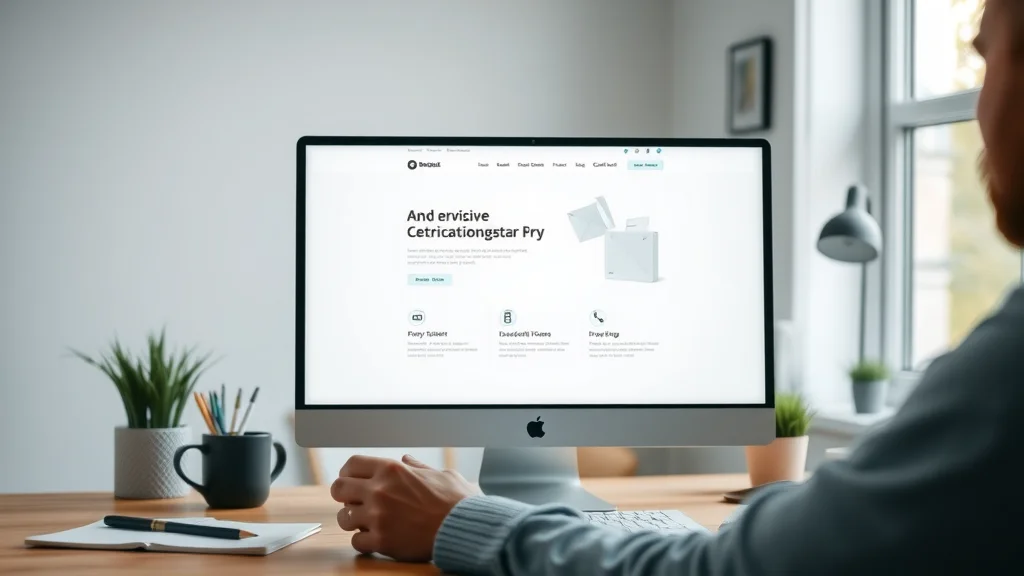
The hero section is the first area visitors see. It uses a bold hero image and a clear headline to communicate what your business offers within seconds. The best hero sections combine clean visuals with direct text—no confusion, no fluff. On mobile devices, a hero area should stack seamlessly, keeping the main image, headline, and supporting copy front and center. This top-of-page clarity is often the deciding factor in whether a visitor stays or moves on to a competitor.
Your value proposition—the main reason people should choose your business—is placed right in the hero section, supported by visually engaging photos that represent what you do or who you serve. Avoid clutter: don’t add sliders, excessive text, or competing images. Instead, guide the visitor’s eyes directly to what matters. The stronger the first impression, the higher the trust and engagement.
Call to Action: Guiding Next Steps
- Strong, visible calls-to-action
- Clear directions for contacting, booking, or purchasing
- Avoiding multiple competing CTAs
Every landing page should have one clear call to action (CTA), such as “Call Now,” “Book Online,” or “Get a Free Estimate. ” A visually distinct cta button draws attention and tells visitors exactly what to do next. Avoid too many options or placing your primary CTA below the fold (outside the initial view window). When CTAs are easy to find and understand, potential customers are much more likely to act.
Make sure directions are direct—don’t make people guess whether to call, email, or schedule an appointment. If your business offers several ways to connect, prioritize a single next step. Multiple, competing CTAs can confuse visitors and reduce your overall conversion rate. To boost engagement, repeat the primary CTA at intervals as users scroll.
Social Proof: Earning Trust Quickly
- Testimonials, reviews, and recognizable logos
- How social proof fits into landing page structure
- Placing social proof where scanning eyes fall
Trust must be earned quickly, especially for local service providers and small businesses. Adding social proof—such as customer testimonials, reviews, or partner logos—signals credibility and reliability. Proactively placing these between the value proposition and main CTA ensures that even scanners see them. Visual cues like star icons, review badges, and user photos reinforce positive first impressions.
A landing page’s social proof should be authentic and easy to spot. Highlight reviews from real customers, share before-and-after results if appropriate, and include recognizable local or industry logos wherever possible. By integrating social proof directly into the visual flow of your page, you encourage trust and action without overwhelming the visitor with text.
Simplicity and Flow: Making Navigation Effortless
- Simple, linear page design
- Why less navigation results in more conversions
- Page speed and easy-to-scan content blocks
Clutter is a major barrier to engagement. Streamline your page’s structure by removing unnecessary navigation links, sidebars, or external distractions. A linear approach—where visitors simply scroll down to learn more—reduces decision fatigue and keeps the focus on your offer. Each content block should feature ample white space, clear headings, and brief supporting details, making it easy for eyes to scan and prioritize.
Additionally, page speed matters as much as appearance. Slow-loading images or scripts cause frustration and abandonment. Limit graphics to what supports your core message, and make sure that content displays quickly even on mobile devices. Efficient flow, minimal distractions, and visually logical structure combine to create converting landing pages that welcome and direct visitors instead of confusing them.
Product Landing Page vs. General Landing Page: Structure Matters
- Differences in product landing page structure and focus
- When to use a product landing page
- How product landing page structure drives lead generation
Product landing pages serve a focused purpose: presenting one offer, product, or service in detail and guiding the visitor directly to action. Unlike general homepages or service listings, a product landing page highlights a single solution, streamlines decision-making, and often includes a tailored cta button near product information. The structure moves from headline, imagery, and benefits, to proof points, objections addressed, and the purchase or inquiry step. This targeted approach means less distraction and higher conversion rates.
Use a product landing page when you want to promote a specific offer or campaign—such as seasonal services, new menu items, or featured solutions. Structure matters even more here: clear differentiation, benefit statements, and direct calls to action keep potential customers engaged and reduce drop-off. By clarifying value and minimizing competing links, product landing pages help drive more direct lead generation than a sprawling, general page.

The Anatomy of a Converting Landing Page
| Section | Purpose | Best Practices |
|---|---|---|
| Hero Section | Establish instant clarity | Concise headline and supporting image |
| Offer/Value Proposition | Communicate value | Short, benefits-focused copy |
| Social Proof | Build trust | Visible testimonials, badges, or reviews |
| Call to Action | Drive action | Bold, directive buttons |
| Contact Form / Booking | Create conversion | Short, simple to complete |
| Footer | Provide secondary navigation | Keep minimal, links to essential info |
How Landing Page Structure Directly Influences Conversion Rates
- Clear structure = faster user understanding = higher conversions
- Simple content and visual cues guide visitors to act
- Structure impacts trust, credibility, and comfort level

When your landing page structure is organized, with headlines, images, CTA buttons, and social proof in logical order, visitors don’t need to think—they simply absorb and react. This clarity reduces decision time and increases the rate at which visitors convert to leads, whether through calls, contact forms, or online bookings. The less a visitor must search or click, the higher your conversion rate tends to be.
Simple and clearly marked pathways guide visitors from introduction, to understanding offer, to taking action. The way information flows—supported by whitespace, logical blocks, and a dominant CTA button—reassures visitors that your business is professional and easy to engage with. Consistent structure and clarity don’t just influence first impressions—they solidify trust and comfort, which are essential for any business striving for greater lead generation.
Why Small Businesses Lose Leads: Common Landing Page Structure Mistakes
Message Clarity Issues
- Unclear value proposition
- Overly technical or lengthy copy
Many small businesses lose leads not because of what they offer, but because their websites don’t communicate it quickly. When the value proposition is hidden, overly detailed, or written in language that visitors don’t relate to, the message gets lost. If a visitor can’t tell what your business does within seconds of landing on your page, the chance they’ll contact you drops sharply. Using plain, simple statements and showing results—such as customer reviews or before-and-after photos in your hero section—can prevent this common mistake.
Navigation Complexity
- Too many links and options
- Non-linear flow disrupts conversions
A common pitfall is overwhelming visitors with choices. Extra navigation bars, unrelated services, or multiple links divert attention away from your CTA. For most lead generation sites, less truly is more: a direct path increases engagement. When you force users to jump between pages, you actually increase friction and decrease conversions. Keeping the structure linear, with information presented in a deliberate order, improves focus and lead flow.
Weak or Hidden Calls-to-Action
- CTAs below the fold or too subtle
- Confusing next steps for the visitor
If your cta button is hidden, insubstantial, or blends in with the rest of the page, you make it harder for visitors to take action. Avoid burying your CTA under text blocks or putting it at the very bottom of a long page. Use color and size to highlight calls-to-action, repeat them if your page is long, and keep next steps clear and unambiguous to prevent confusion.

Landing Page Structure for Mobile-First Browsing
- Landing page structure must prioritize mobile experience
- Single-column layouts and thumb-friendly design
- Fast-loading images and concise content
Since most web browsing now happens on smartphones, landing pages must be designed for mobile users first. Single-column layouts keep text and images readable, while large CTA buttons are easy for thumbs to tap. Content should be short and direct, with information prioritized so that nothing essential is hidden below endless scrolling or slow-loading carousels.
Reduce reliance on big images or animations that can slow load speeds on mobile connections. Instead, focus on clear, high-contrast elements that stand out. Make sure forms and CTAs are always visible without zooming or side-scrolling. Testing your landing page on multiple devices ensures a consistent, welcoming experience and supports modern customer behavior.
Building Trust and Credibility Through Landing Page Structure
- Consistent branding and visual hierarchy
- Strategic placement of testimonials and badges
- Demonstrating transparency and accessibility

Trust is built not only by what you say, but how you say it—and where you place visual signals of reliability. Strong landing page structure uses consistent colors, clear fonts, and a logical visual hierarchy. It highlights reviews, testimonials from real customers, and recognizable industry badges where visitors’ eyes naturally fall. This blend of design and content makes your business seem more accessible and transparent from the moment a visitor arrives.
Good structure also means making contact details, certifications, and support options easy to find—usually in brief, well-placed footer elements. These trust signals reduce hesitation and make it easy for visitors to decide the next step is safe. For small businesses, credibility is everything, and your landing page should demonstrate it clearly.
Comparing Multiple Businesses: The Role of Landing Page Structure
- How landing page structure helps visitors choose quickly
- Side-by-side clarity impacts which business gets the lead
- Case study examples: structure vs. confusion
Visitors don’t just buy based on reputation—they buy from what they understand most easily.
Almost all customers compare several businesses when making a decision. If a visitor lands on two sites—one with a clear, direct landing page structure and another with cluttered navigation—they will almost always move forward with the easiest-to-understand option. Simplicity and clarity win over excessive detail or complex navigation.
Case studies routinely show that after structural upgrades, such as streamlining information or improving CTA visibility, businesses see measurable increases in lead generation. The easier it is for potential customers to compare and contact you, the more likely you are to win their business—even over competitors with equal or better reputations.
Case Studies: Landing Page Structure Transformations
- Before and after examples of improved landing page structure
- Lead generation lift after structure and clarity upgrades

Real-world improvements come from more than a new design—they come from restructuring the way information is delivered. Small businesses who move from cluttered, multi-click homepages to clean, fast, single-page layouts consistently achieve higher conversion rates. For example, swapping dense paragraphs for easy-to-read sections, highlighting key credentials up top, and making the CTA button impossible to miss can transform results. These are not dramatic changes, but they pay real dividends over time as site traffic turns into customer leads.
Case studies across retail, medical practices, restaurants, and home services reveal one consistent outcome: clear structure equals more leads. When the pathway from information to action is simple, every visitor can see what you offer, understand why it matters, and act without second-guessing.
Checklist: Optimizing Your Landing Page Structure for More Leads
- Assess the clarity of your hero section and headline
- Eliminate unnecessary navigation links
- Improve mobile responsiveness and speed
- Ensure calls-to-action are always visible
- Reduce and simplify forms
FAQs: Structuring Landing Pages for Better Conversion
How should a landing page be structured?
A strong landing page starts with an attention-grabbing headline and a clear hero image. Immediately state your value proposition so visitors know what you offer. Next, add short customer testimonials or social proof to build trust, followed by a visible call-to-action instructing visitors on what to do next. Maintain a clean, single-column design that works on any device, and make it as easy as possible to take the next step.
What are the 7 C's of a website?
- Clarity
- Consistency
- Credibility
- Content
- Context
- Connectivity
- Convenience
The 7 C’s serve as a foundation for effective website and landing page design. Ensuring your site checks each box makes it easier to attract, convert, and build trust with customers.
What are the parts of a landing page?
- Hero section
- Value proposition
- Social proof
- Call-to-action
- Contact form
- Footer
Each part plays a distinct role—guiding visitors from curiosity to action. All key information should flow logically and be easy to find, especially on mobile.
What are common landing page mistakes?
- Cluttered navigation
- Unclear messaging
- Slow load times
- Weak calls-to-action
Many businesses make the mistake of overloading landing pages with too much information, confusing links, or hidden CTAs. Keeping the page fast, simple, and clear helps visitors take the action you want.

Key Takeaways: Why Landing Page Structure Impacts Leads and Conversions
- Clarity and simplicity increase conversions
- Mobile-first thinking is essential
- Clear landing page structure builds trust fast
- Small changes can yield more leads for any small business
Next Steps for Improving Your Lead Generation Website
- Consistent improvement builds trust and results over time
- Simple, clear landing page structure is the foundation for lead generation
- Compare your own site against the checklist for actionable improvements
Watch: See a short explainer video that visually breaks down the key sections of a high-converting landing page—witness the transition from cluttered to clean layouts, and learn how structure boosts clarity and leads. For real-life demonstrations of the system, visit the resource below.
Learn How Lead Generation Websites Work to Get More Business
- Discover the fundamentals of lead generation website structure and see real-life examples at https://localauthoritycontentsystem.com/lead-generation-website-system
If you’re ready to take your website’s performance to the next level, consider exploring the broader strategies behind local authority content publishing. By adopting a structured approach to your entire content ecosystem, you can build lasting credibility and stand out in your market. For a deeper dive into how these principles can transform your business’s online presence, visit the Local Authority Content System™ Insights & Strategy page. There, you’ll find advanced guidance on content structure, authority-building, and sustainable lead generation—empowering you to move beyond landing pages and create a truly influential digital footprint.
Every small business can benefit from clear, consistent improvements in landing page structure. Simple tweaks to layout and messaging—grounded in how people actually browse—can lead to more trust, more leads, and lasting business growth.


Write A Comment