


Imagine landing on a business website for the first time: You want quick answers, you scroll as you scan, and you decide in seconds whether to stay or go. For small businesses, a website with a clear, streamlined contact form can mean the difference between a new lead and a lost opportunity. Today, website contact form optimization is a key factor that shapes whether visitors become customers or simply move on to a competitor.
Understanding Website Contact Form Optimization in the Context of Lead Generation
"In today's online world, visitors form impressions in seconds, making website contact form optimization essential for effective lead generation."
- How website contact form optimization changes visitor behavior
- What shapes effective conversion rate
- Why contact form design impacts lead generation
- Actionable web form tips for all business types
- How mobile device usage and clarity in form fields increase form conversion rates

When it comes to getting new customers, website contact form optimization is not just a technical task—it’s about understanding how real people browse business websites today. Most site visitors don’t read every word or navigate through multiple pages. Instead, they form their first impression and often decide if they’ll contact a business based on how quickly and easily they can interact with a contact form. By connecting the dots between browsing habits and clear website guidance, your business can move beyond simply being “online” and can begin to actively convert visitors into valuable leads.
As more potential customers rely on their mobile devices to browse for local products, services, or restaurants, the structure and design of your web form become critical. Visitors expect a fast, smooth, and simple experience—one that doesn’t require excessive clicking, reloading, or searching for your phone number or email address. This guide provides straightforward, actionable principles so any small business can improve their website’s lead generation results simply by paying attention to how their contact forms are presented and used.
Optimizing your contact form is just one piece of the puzzle—structuring your entire website for clarity and authority can further enhance your results. For a deeper dive into building trust and credibility through content, consider reviewing the Structured Local Authority Publishing approach, which outlines proven strategies for organizing your site to support both user experience and search visibility.
The Role of Website Contact Form Optimization in Small Business Lead Generation
Why Contact Form Design Matters for Conversions and First Impressions
- Visitors form judgments of credibility almost instantly
- Complex contact forms reduce form conversion rates
- Clarity and simplicity in contact forms guide user actions
When a website visitor opens your homepage, their judgment about your business happens within seconds. Studies and real-world behavioral analysis show that elements such as contact form design and placement carry enormous weight. A confusing or overloaded contact form can immediately cause a potential customer to lose trust, especially if they are comparing several businesses side by side. A well-optimized contact form with clearly labeled fields increases the chances that a user will complete the process, raising your form conversion rate and supporting your business goals.
Simplicity is not just a trend—it’s a practical solution for higher engagement. Forms that ask for too much information, include unnecessary fields, or use unclear language make visitors hesitant. Instead, think about the user experience from a first-time site visitor’s perspective: Would you fill out the form, or would you hesitate? Clear instructions, a logical flow, and obvious calls-to-action lead to higher form conversions and allow your business to make a trustworthy impression immediately.
Defining Conversion: More Than a Click—The Journey from Visitor to Customer
- Conversion means a visitor takes a defined action: call, booking, purchase, or submitting a web form
- Contact forms are the bridge to customer engagement
- Conversion rates reflect the effectiveness of website contact form optimization
In digital marketing, “conversion” refers to the point where a website visitor follows through—by calling, booking, purchasing, or submitting a contact form. For most local and service businesses, the contact form is not just a feedback tool but the main pipeline for turning interest into real conversations and revenue. The conversion rate—the ratio of completed forms to total visitors—is a primary indicator of how effective your website contact form optimization really is.
Every visitor represents a potential customer. But unless your website and forms are designed for clarity and simplicity, many of these opportunities are missed. Effective contact form optimization bridges the gap between browsing and action, helping your business gain more leads without needing more traffic or expensive marketing campaigns. It’s about turning site traffic into real connections by making the visitor’s journey intuitive and rewarding.
How Visitors Browse Websites and Interact with Contact Forms
Modern Browsing Habits: Scrolling, Scanning, and Skimming
- Users scroll instead of navigating multiple pages
- Too many clicks decrease form conversion
- Mobile device browsing changes user expectations
Most website visitors today aren’t clicking through page after page—they scroll. This habit is shaped by mobile device use, social media, and the sheer amount of information competing for attention. A contact form or call-to-action that requires a user to click multiple times before they even see it often leads to lost leads. Reducing the number of clicks and keeping everything on one or two clear screens directly improves the user experience and boosts conversion rates.
Modern form design must consider how users scan for information. They skim headlines, look for buttons, and only read closely when something catches their attention. Making your web form clear, visually inviting, and easily accessible answers these expectations—especially when most users are on a mobile device, and interruptions like pop-ups or unclear navigation quickly drive them away.

Attention Spans: The 8-Second Rule and Form Conversion
- Most visitors scan, not read thoroughly
- First impressions influence trust and conversion rates
- Clear contact forms improve the chances visitors finish the process
It’s widely observed that the average web user has an attention span of around 8 seconds—about the time it takes to scan a landing page. This period determines whether a visitor will continue engaging or move to a competitor’s site. If your website contact form is easy to find, labeled well, and requires minimal effort to fill out, you dramatically increase the chance of a completed form submission. First impressions matter, especially given how quickly site visitors move on when something doesn’t make sense.
To keep users engaged, use short, clear instructions for every form field. Elements like visual separation, logical ordering (such as name, email address, phone number), and direct calls-to-action all play a major role in increasing the form completion rate. Every additional second of confusion or surprise is an opportunity lost; clarity is your greatest driver for lead generation.
Core Website Contact Form Optimization Principles for Lead Generation
Simple Form Design to Increase Conversion Rate
- Minimal form fields reduce friction
- Label fields clearly: name, email address, phone number
- Use conditional logic to keep forms focused
A successful form design is always built around making the process as straightforward as possible for the visitor. Fewer required fields mean a lower barrier to communication. Studies show that reducing a form to the essentials—usually just name, email address, maybe phone number—can markedly increase both engagement and completion rate. By minimizing requests for additional information, you let site visitors control how much they want to share, decreasing hesitation and improving your form conversion rate.
Label each form field with clear instructions, and consider using conditional logic—for example, only show extra options if the visitor selects a specific service or inquiry type. This avoids overwhelming users while keeping all necessary fields easily accessible when needed. This focus on user experience is one reason why modern web forms now lead the way in generating valuable customer contacts for small businesses.
Mobile-First Web Form Layout Improves Conversion Rates
- Forms must be accessible and easy to complete on mobile devices
- Touch-friendly buttons and visual cues increase form conversions
With over half of all site visitors now using a mobile device, designing your web form for seamless mobile interaction is no longer optional. Mobile users expect touch-friendly controls, easy-to-read labels, and simple navigation. If your form fields are crowded or hard to tap, if the “submit” button is too small, or if visitors need to pinch and zoom, many will abandon the form before completion.
A mobile-first approach to form design includes large, touch-optimized inputs for name, email address, and phone number, prominent calls-to-action, and clean layouts that are easy to scroll through. These changes have a direct effect on form conversion rate, especially for businesses where local and on-the-go searches are common, such as restaurants, home services, and medical offices.

Speed and Simplicity: Reduce Page Load and Complexity
- Faster loading increases engagement and completion rates
- Visitors leave if processes or information are unclear
One often overlooked element of website contact form optimization is speed—how quickly the form (and page) loads. Every additional second can increase visitor drop-off, especially when people are multitasking on a mobile device. Simple structures, lightweight page scripts, and clear messaging mean more visitors proceed to fill out your form, ultimately driving up your form conversion rate.
Complex designs with confusing navigation or unclear instructions contribute to a sense of “work” for the visitor. The easier you make it for them to fill out your form—whether by using obvious field labels or eliminating unnecessary screens—the more likely they are to complete it. Removing clutter helps your business stand out to customers who expect a clear and frictionless online experience.
Clarifying the Visitor Path: Using Contact Form Optimization for Better Results
One-Page Websites and Clear Calls-to-Action Improve Form Conversion Rate
- Reducing navigation steps keeps visitors focused
- Strong calls-to-action guide users toward contact forms
- Simple, direct communication answers visitor questions before they ask
One-page websites and landing pages that keep messaging all in one place reduce confusion for visitors. Rather than asking users to click through multiple sections to find a contact form, everything is laid out sequentially: business introduction, services, testimonials, and a clear call-to-action. This structure helps maintain the focus of site visitors, increasing both form completion and conversion rates.
Direct communication is key. When the next step—such as “Call Now” or “Request an Appointment”—is highlighted with a strong, accessible button above or next to the form, hesitation drops and more users follow through. Common visitor questions (like “How soon will I hear back?” or “Is my information safe?”) should be answered within the contact form section itself, streamlining the user experience and eliminating friction.
Setting Expectations: Social Proof, Trust, and Transparency in Contact Forms
- Instill trust with testimonials or reviews near the web form
- State what happens after submitting the contact form
- Business information and privacy reassurances contribute to higher conversion rates
Building trust is critical, especially for visitors unfamiliar with your business. Placing social proof such as testimonials or star ratings close to the call-to-action or web form reassures site visitors that others have had positive experiences. This psychological effect increases willingness to complete the form conversion process.
Be transparent about what happens next: “We’ll get back to you within 24 hours” or “Your information is never shared. ” Simple statements like these, along with business credentials, privacy assurances, and even local office information, all contribute to a higher form conversion rate. They help close the trust gap that often separates an interested visitor from becoming a new customer.

Common Mistakes: How Confusion and Complexity Reduce Lead Generation
- Too many required fields lower form conversion rate
- Unclear next steps or vague instructions cause visitors to leave
- Hidden or hard-to-find web forms cost businesses valuable leads
A major reason businesses lose leads isn’t lack of demand, but confusion and complexity on their website. Asking for excessive contact information, hiding the web form, or leaving the next steps vague are all common errors. Each additional field creates one more barrier for the site visitor. When instructions aren’t clear, visitors worry about mistakes or wonder what will happen with their information—and many simply give up.
Making the contact form easy to find, keeping fields to a minimum, and providing clear, rewarding calls-to-action are simple steps that increase conversion rates. Avoid hiding your main CTA or placing the web form below unrelated content. Recognize that visitors comparing multiple local businesses will almost always move on if they can’t easily understand how to contact you or what happens next.
Website Contact Form Optimization in Action: Tips for Maximum Conversion Rates
| Optimization Feature | Impact on Conversion Rate |
|---|---|
| Minimal Form Field | Higher completion rate |
| Clear CTAs | Guides visitors and reduces confusion |
| Mobile device-friendly design | Better access and completion on smartphones |
| Page load speed improvement | Lower abandonment rate |
| Social proof placement | Boosts visitor trust |
"Optimized contact forms can transform a website from a static brochure into a lead-generating asset for any small business."

Top Website Contact Form Optimization Strategies for Local Businesses
- Keep contact form design simple and user-friendly
- Ensure mobile device compatibility for web forms
- Use conditional logic to personalize the process and reduce unnecessary fields
- Place social proof near contact forms to build trust
- Clarify what will happen after form completion
- Test different form placements and measure conversion rates regularly
How Competition and Online Comparison Shape Lead Generation Success
Why Clarity and Website Contact Form Optimization Beat Reputation Alone
- Customers compare multiple businesses at once
- Most users contact the first business that is easy to understand
- Clear messaging paired with optimized contact forms speeds up decision-making
Small businesses aren’t just competing on service quality—they’re competing for attention and clarity. When potential customers search online, they quickly open several sites. The business whose offer is easiest to understand, with visible calls-to-action and a frictionless contact form, often wins the inquiry—sometimes before competitors are even considered. First impressions are earned by clear, straightforward messaging, and confusion almost always results in lost opportunities.
The simplified experience provided by website contact form optimization helps visitors quickly grasp your value and move from browsing to acting. Businesses that assume reputation alone will win fail to realize that today’s buyers prioritize ease of use and fast results when making decisions online.
Website Contact Form Optimization as a Competitive Edge
- A streamlined, clear web form consistently brings in more leads
- Even high-traffic websites lose out if conversion-oriented design is ignored
Having a well-designed web form is a true competitive advantage. Even if competitors generate more website traffic, a simple, optimized contact form ensures your site converts more visitors into real inquiries. Sites with complicated navigation, unclear calls-to-action, or slow loading speed may attract visitors—but they fail to convert them at the same rate.
By refining your form design with customer needs in mind, you encourage more users to fill out the form on their first visit. This is especially effective in local service, retail, and professional sectors, where customers often compare several businesses and reach out to the one that makes the interaction easiest and most transparent.

Measuring the Impact of Website Contact Form Optimization on Lead Generation
Reviewing Conversion Rate and Form Completion Metrics
- Track form conversion rate with analytics tools
- Optimized forms show higher completion and fewer abandoned entries
To ensure your website changes are effective, it’s vital to measure the impact of your website contact form optimization efforts. Review your conversion rate—the percentage of unique visitors who complete your contact form—using a reputable analytics tool. This data quickly shows whether your adjustments, such as simplifying form fields or improving mobile layout, are increasing form completion rates and lowering abandonment.
Frequent testing and review help pinpoint what works best for your specific audience, whether that’s adding trust badges, adjusting field order, or rewording your main CTA. Even small improvements in completion rate can mean dozens of additional new leads each month, turning your website into a consistent source of inquiries for your business.
Continuous Improvement: Small Updates Lead to Better Results
- Regularly review web form performance
- Adjust CTA wording, field order, and layout to drive more conversions
Effective lead generation is rarely the result of a single perfect solution. Instead, the most successful websites treat contact form optimization as a continuous process. By testing new features—such as alternate button text, different field sequences, or new testimonial placements—you maintain a dynamic approach that keeps performance high as user behaviors and expectations shift.
Testing, measuring, and iterating based on real performance data leads to more effective customer acquisition over time. Remember: website clarity, user trust, and efficiency are long-term investments, not quick fixes. Just as your business evolves to meet new customer needs, so should your online forms.
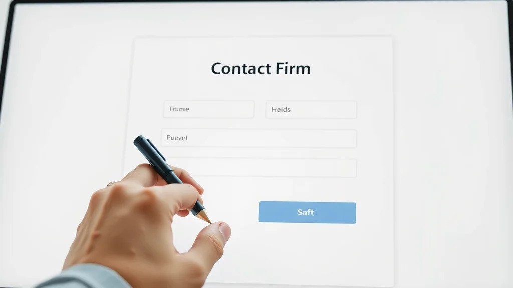
Small Business Web Form Before and After Optimization
FAQ: Website Contact Form Optimization, Conversions, and Best Practices
What is website contact form optimization and why does it matter for lead generation?
- Optimization is the process of making contact forms as user-friendly, clear, and efficient as possible.
- Well-optimized contact forms convert more visitors into leads by reducing confusion and simplifying the user journey.
How does mobile browsing affect website contact form conversion rate?
- Mobile browsing dominates user behavior, so forms must be easy to fill out on smartphones.
- Forms not designed for mobile device use have much lower conversion rates.
What actions can businesses take to improve contact form conversion rate?
- Reduce unnecessary form fields, use clear CTAs, optimize for mobile, and add social proof.
Why do some visitors abandon contact forms before completion?
- Common reasons include too many fields, unclear instructions, lack of mobile optimization, and slow page speed.
Does adding social proof to a contact form really increase form conversions?
- Yes, testimonials, reviews, or trust badges placed near contact forms build confidence and increase action rates.
Key Takeaways: Website Contact Form Optimization for Lead Generation Success
- Clarity, simplicity, and mobile-first design increase conversion rates
- Contact form optimization reduces friction in the customer journey
- Testing and measuring form performance is essential
- Business visibility is tied to ease of understanding and form accessibility
People Also Ask: Website Contact Form Optimization Insights
How do I optimize my website contact form for maximum leads?
- Use clear, concise language and limit required fields. Avoid unnecessary clicks or steps and ensure mobile responsiveness.
What affects form conversion rates the most on business websites?
- The simplicity of form design, clarity of messaging, mobile optimization, and speed all influence form conversion rate.
What is the best placement for a website contact form to improve conversions?
- At the end of a clear call-to-action section, ideally visible without excessive scrolling, and easily accessed on every device.

Video Guide: Website Contact Form Optimization Walkthrough
Step-by-Step Process for Small Business Website Owners
In Summary: Better Website Contact Form Optimization Means Better Lead Generation
- Visibility and trust build over time through website clarity
- Simple improvements in contact form design often increase conversions
- Businesses that make it easy for visitors to act get chosen more often
- Regular reviews and updates maintain lead generation success
If you’re ready to take your website’s performance to the next level, consider how a holistic content strategy can amplify the impact of your optimized contact forms. By adopting a structured publishing system that positions your business as a local authority, you not only improve user experience but also strengthen your search engine presence and credibility. Discover how the Structured Local Authority Publishing framework can help you build trust, organize your content for maximum engagement, and unlock new opportunities for sustainable lead generation. Elevate your digital strategy and turn every website visit into a step toward business growth.
See How Lead Generation Websites Work in Action
Ready to see optimized lead generation in practice? Explore how lead generation websites help local businesses grow with clear structure, optimized forms, and proven user experience strategies fit for every type of small business.


Write A Comment