


Imagine walking into a busy store where products are stacked everywhere and no signs point you in the right direction. Online, a website’s layout either guides or confuses visitors in the same way. Most potential customers decide within seconds whether they trust a business, understand its offer, and feel ready to act—all based on what they see and how easily they can move through a website. This guide explains how small businesses—ranging from retail shops and local restaurants to professional services—use website layout for conversions to compete online, connect with more customers, and drive consistent lead flow.
Understanding Website Layout for Conversions: Why It Matters to Small Businesses
The way a website is structured has a profound effect on whether visitors become paying customers or simply move on. In today’s fast-moving digital world, small businesses face stiff competition not just from rivals in their industry, but from every other website their customers visit. If your layout is confusing or the value isn’t clear right away, even excellent businesses lose leads to others that communicate faster and more simply.
A conversion-focused website design is about more than looking visually appealing. It’s about arranging information and visuals so that anyone—no matter their age or tech skills—quickly understands what your business offers and what to do next. That means a layout built to guide behavior, where strong calls to action (CTAs), easy navigation, and mobile-friendly features reduce the number of steps needed to inquire, call, or buy. With most people browsing on mobile devices and making snap decisions, the website layout for conversions makes you the obvious choice for your target audience.
- How website layout for conversions shapes user behavior and first impressions
- The key factors that influence conversion optimization and website conversion
- Core principles of lead-generating website design and user experience
- Practical steps to create a converting website that generates more leads
How Users Behave Online: The Critical First Seconds of Website Layout for Conversions
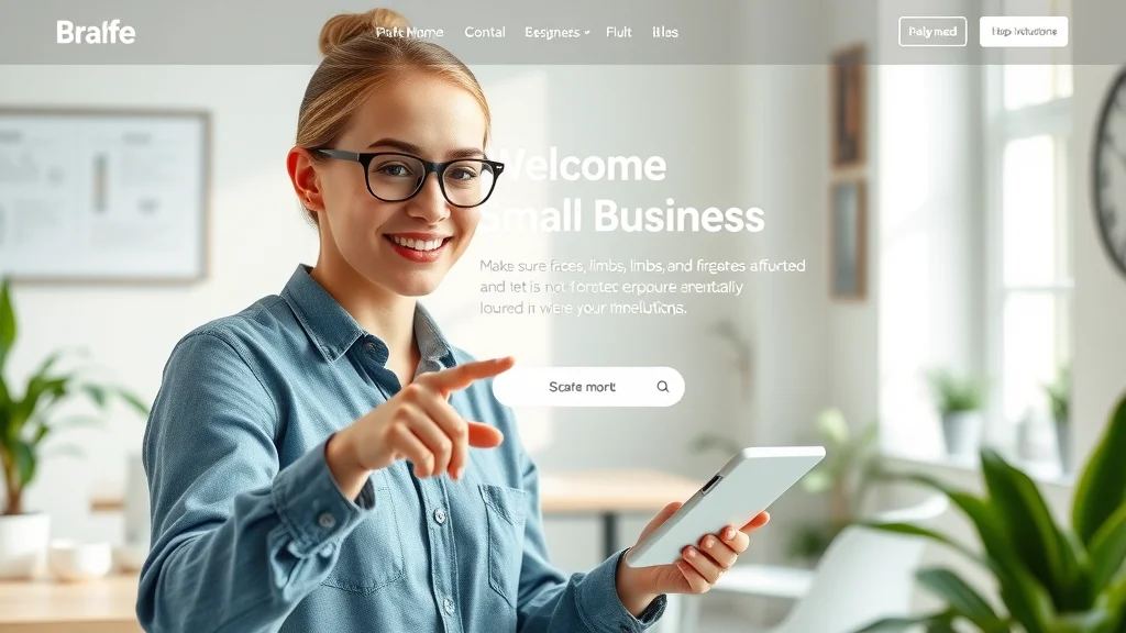
Most people decide within just a few seconds whether they trust a website enough to keep exploring. This isn’t because they’re impatient—it’s because almost all of us have grown used to finding what we need quickly online. If visitors don’t immediately see your business purpose or next step, they click away, often never to return. That’s why your homepage and landing page should present vital details and CTAs clearly above the fold, using a simple color scheme and easy navigation that matches common web design patterns.
Since people mostly scan and scroll, not read every word, businesses need to prioritize what information appears first and how it draws attention. Mobile browsing further intensifies this behavior. Users on smartphones expect one-page layouts that flow smoothly as they swipe, and friction—such as long forms or too many menu options—leads to lost leads. For every second wasted on complex navigation, potential customers consider competitors that feel simpler or more welcoming, making website layout for conversions absolutely critical from the first moment of engagement.
For small businesses looking to refine their approach, understanding the structure and flow of a high-performing lead generation website can make a significant difference. You can explore a detailed breakdown of the lead generation website system for small businesses to see how each element works together to drive more inquiries and conversions.
First Impressions: How Website Design and User Experience Affect Conversions
- Attention spans and scanning—typical website behavior patterns
- Why users scroll rather than carefully read content
- The influence of mobile browsing on landing page and web design choices
Attention spans average around eight seconds, meaning solid website design must guide visitors through a well-marked path right away. Studies using heat maps show that most site visitors look for bold headlines, clear CTAs, and concise statements of value within the top part of a webpage. Instead of deeply reading, visitors tend to scan for important info, looking for a visible cta button, trustworthy visuals, and simple cues about your offer. Sites that hide their value behind tabs, clutter, or distracting designs often see lower conversion rates than those with clean layouts and a clear flow.

Reducing Friction in Website Layout for Conversions
- Complex navigation structures vs. simple, one-page layouts
- Minimizing required clicks to improve site conversion
Friction—think unnecessary clicks, confusing menus, or scattered options—blocks conversions. Website layouts with complicated navigation force users to hunt for what they need. By comparison, a one-page design or streamlined landing page reduces steps and keeps users focused on taking action, whether that’s calling, filling out a contact form, or booking a service. Every extra click risks losing the visitor's interest, so consolidating your message and call to action on a single scrollable page helps modern businesses earn more leads. Remember, visitors want to take the desired action quickly and without second-guessing.
Defining Conversion: What Website Layout for Conversions Means for Small Businesses
For small businesses, “conversion” means more than just website traffic. It’s about guiding visitors to click, call, schedule, or fill out a form—turning browsers into customers. Conversion optimization takes into account how each part of your website layout for conversions can move a visitor closer to becoming a client, using clearly placed buttons, easy-to-find contact options, and forms that don’t overwhelm. The real goal isn’t to share every detail, but to move the right people toward meaningful actions.
Track actions that matter: phone calls, bookings, purchases, and completed forms on your landing pages. Each action shows your website is doing its job as a lead generation tool. Landing pages—especially when designed for specific offers—often produce higher conversion rates than generic homepages, because they present value and CTAs without distraction. By treating conversion as an ongoing process, businesses can gradually refine site structure, color scheme, headline placement, and CTA location for better results.
- Calls, bookings, purchases, and contact form submissions
- Role of landing pages in boosting conversion rate
“Conversion is about guiding visitors to become customers—not just informing them.” — Expert in website design

Why Many Businesses Lose Leads: Common Website Layout Mistakes
Businesses rarely lose leads because of their service quality. Most lost opportunities come from unclear, cluttered, or confusing website layout for conversions. If a new visitor can’t figure out what you offer—or can’t find your call to action—in just a few seconds, they’re likely to leave and choose a competitor. This is a common issue for small businesses with outdated web design, buried navigation, or messaging that tries to say too much at once.
Even a visually appealing site won’t convert if the flow mismatches how people browse. Many small businesses use multi-page navigation when their audience prefers a single, scrollable page. Others rely on dense menus or popups that disrupt the natural decision-making process. By failing to prioritize clarity and ease over features, businesses unintentionally raise obstacles in the way of site conversion—resulting in fewer inquiries or sales, even if traffic is strong.
Message Clarity: How a Converting Website Communicates Value Fast
- Unclear business purpose or offering in the first view
- Difficult navigation and overwhelming options reducing website conversion
- Mismatch between website layout and user browsing patterns
First impressions depend on how instantly a visitor “gets” your message. The best converting websites place a clear headline and concise value statement front and center, with a strong CTA button in plain view. When navigation is difficult, options feel overwhelming, or important info is hidden below the fold, confusion sets in and conversion rates drop. Align your web design with how real people browse—scanning, scrolling, and evaluating what action to take next. If your website’s structure doesn’t support that, leads are lost before a conversation can even begin.

Core Principles of Website Layout for Conversions and Lead Generation
Certain universal principles reliably help small businesses build websites that turn visitors into leads. The most effective website layout for conversions sticks to one-page layouts, clear messaging, and easy-to-use forms and contact options. All of this supports how people actually use sites today—mainly on phones, with a preference for less clicking and immediate clarity. Simple color schemes, strong contrast for CTA buttons, and logical visual hierarchies help highlight the next step.
Core essentials also include mobile-first design (since most visitors use mobile devices), fast load times that reduce bounce, and visible, actionable buttons appearing throughout the page. These strategies don’t just improve the user experience; they also encourage higher conversion by making each step—contact, booking, or purchase—natural and expected. By focusing on reducing friction and building trust, your business can generate more leads without complex features or clutter.
- One-page website layouts to reduce friction
- Clear messaging for rapid visitor understanding
- Visible, strong CTA button on landing page and throughout the site
- Mobile-first design principles for better conversion rates
- Optimized page speed to keep users engaged and minimize bounce
- Simple color scheme and visual hierarchy for user experience
How Businesses Compete Online: Standing Out with Website Layout for Conversions
Competing online isn’t just about who has the best service or product. It’s just as much about which small business presents its offer in the clearest, quickest way. Visitors typically compare three or four sites, then contact the one that’s easiest to understand—often without even considering the rest. That’s why clarity, ease, and speed are the true battlegrounds where small businesses win or lose leads online.
Whether you run a local service company, retail shop, or professional office, the core question is: How fast can someone see your offer, understand its value, and know exactly how to take the next step? A site with a strong, visible CTA button, streamlined navigation, and relevant design choices for your business type lifts your conversion rate and helps you stand out. Comparing layouts—using tools like heat maps—shows that businesses with the simplest website structure typically attract more inquiries, while complex sites see visitors click away, sometimes without ever reading a blog post or scrolling below the fold.
Competing on Clarity, Ease, and Speed
- Clear presentation of offers and values
- Direct, actionable calls to action that guide decision-making
- Relevance of design choices for different small business types (retail, services, local businesses)
The clearer and simpler your website, the more customers you’ll earn—because today’s site visitors are skimming, not lingering, as they compare. Strong performance comes from prioritizing key information, using a bold CTA button, and limiting distractions so action feels obvious. Comparing your website with competitors can reveal weaknesses—like non-obvious navigation or hidden booking forms—that, when corrected, can lead to higher conversion rates and more effective online competition.
The Role of Social Proof in Increasing Conversion Rate
Social proof—things like reviews, star ratings, or testimonials—builds trust instantly for first-time visitors nervous about taking action. Incorporating customer feedback near call to action areas reassures people that others have had a positive experience. This subtle support can mean the difference between a visitor submitting a form or bouncing to a competitor’s site, especially in markets where reputation and peace of mind drive decision-making. As part of good website layout for conversions, well-placed social proof helps turn browsing into action.

Website Traffic vs. Leads: The Reality of Website Layout for Conversions
Many businesses invest in web design and marketing only to wonder why traffic doesn’t translate into new business. The answer is clear: attracting visitors alone is never enough. If your website doesn’t guide people toward a clear next step, most will simply leave. This gap between site visitors and leads is driven directly by design choices: Is the offer clear? Is the landing page focused? Is there a visible, irresistible CTA button? Even high volumes of traffic mean little if those visitors aren’t steered toward action.
Successful conversion comes from aligning your web design and landing page structure with how potential customers make decisions online. By thinking through each step a visitor takes—and how your site reduces friction—businesses can shift from simply having a website to enjoying a steady flow of leads. It’s not about more blog posts or search engine traffic; it’s about making every single visitor’s experience easy, fast, and rewarding.
- The difference between attracting visitors and guiding conversion rate
- How design decisions and landing page structure shape lead outcomes

Clarity, Trust, and Decision-Making: The Link Between Website Layout for Conversions and Customer Choices
Every website communicates, whether intentionally or not. Sites with clear purpose, well-organized sections, and visible contact information give off instant trust signals—making decision-making easy for potential customers. Trust isn’t just about reputation or awards; it’s embedded in every design decision. Visitors recognize familiar branding, accessible contact info, and clean page layouts as signs of a legitimate, dependable business.
By contrast, a confusing website sows doubt and causes users to hesitate or leave. When your message is clear, your offer is well-presented, and contact or booking steps seem obvious, your chances of converting visitors rise dramatically. Think of every small decision—CTA placement, white space, concise headlines—as steps that guide users toward becoming customers.
- The connection between clarity, trust, and website conversion
- Visual indicators of reliability: easy contact, recognizable branding, clear offers
- How confusion causes lost leads and clear structure wins conversions

Table: Comparing High-Converting vs. Low-Converting Website Layouts
| High-Converting Website Layout | Low-Converting Website Layout |
|---|---|
| Clear one-page structure | Multi-page, complex navigation |
| Strong CTA button in view | Hard-to-find or weak CTA |
| Mobile-first design | Desktop-only, slow loading |
| Clear messaging above the fold | Unclear or hidden value points |
| Optimized page speed | Slow, cluttered experience |
Best Practices: Lists for a High-Performing Website Layout for Conversions
- Have a clear headline and value proposition
- Display CTAs consistently on landing pages
- Prioritize mobile responsiveness and speed
- Limit navigation to reduce friction
- Use social proof elements to support trust
- Keep messaging concise and direct

People Also Ask: Common Questions about Website Layout for Conversions
How does website layout affect user experience and conversion rate?
Website layout shapes both first impressions and overall user experience. A clear, well-structured site helps visitors understand your offer quickly and guides them toward desired actions like filling out a form or calling. When the path is obvious and engaging, your conversion rate rises because users face less confusion and friction during their visit.
Why is a CTA button important in website layout for conversions?
A CTA button serves as a clear signal for what you want the visitor to do next, such as starting a free trial, contacting your team, or making a booking. Its placement, color scheme, and visibility all influence whether site visitors take the intended action. Without a strong, prominent CTA, potential customers may not know how to move forward, lowering conversion rates.
Does a mobile-first web design improve lead generation for small businesses?
Yes, designing with mobile devices in mind improves lead generation. Most users now browse on smartphones, so layouts that are easy to scroll, read, and interact with lead to higher conversion rates. Mobile-first design ensures forms, CTAs, and value statements are accessible without pinching, zooming, or waiting for slow-loading content.
What are the essential elements of a high-converting landing page?
High-converting landing pages include a bold headline, clear value statement, visible CTA button, minimal navigation, and supporting social proof such as reviews or testimonials. Limiting distractions and guiding visitors directly toward a single desired action ensures better performance and greater lead generation from each website visit.

FAQs about Website Layout for Conversions
-
What is the best website layout for conversions for small business websites?
The best layout is typically a one-page site or streamlined landing page with a clear CTA, concise headline, mobile responsiveness, and minimal navigation to reduce friction and boost conversion rate. -
How often should I update my website design to maximize lead flow?
Review your site at least once a year, but consider small, regular updates to messaging, CTAs, and page performance based on analytics and feedback to continuously improve lead generation. -
Is site conversion only about aesthetics, or does functionality matter more?
Both matter, but functionality (clear navigation, fast page speed, strong CTAs) typically drives more conversions than looks alone. Visually appealing sites still need intuitive structures for high conversion rates. -
Can a simple landing page drive higher conversion rates than a multi-page website?
Yes, especially for most small businesses. Simple landing pages with focused messaging and a single CTA often produce higher conversion rates by reducing distractions and making action feel easy.
Key Takeaways for Small Businesses Optimizing Website Layout for Conversions
- Structure your website for quick understanding and easy action
- Focus on reducing friction with simple, intuitive website design
- Ensure messaging is clear from the first moment
- Use a mobile-first approach and fast load times

Building Lasting Results: The Long-Term Value of Good Website Layout for Conversions
- Visibility, recognition, and trust grow with continuous clarity
- Small, regular improvements in structure and communication generate more leads
Explore How Lead Generation Websites Work
- Discover the complete lead generation website system for small businesses: https://localauthoritycontentsystem.com/lead-generation-website-system
Conclusion: Simple, clear website layouts deliver lasting results. Over time, consistency and small improvements in design structure and messaging help small businesses earn the trust and attention needed to generate more leads and outpace the competition online.
If you’re ready to take your website strategy to the next level, consider exploring broader approaches to content and authority building. The Local Authority Content System™ Insights & Strategy offers a comprehensive look at how structured publishing and strategic content can amplify your online presence beyond just layout tweaks. By integrating these advanced methods, small businesses can not only boost conversions but also establish lasting authority in their local markets. Dive deeper into these insights to unlock new opportunities for growth and sustainable lead generation.


Write A Comment