


Introduction: Rethinking Online Presence with Landing Page vs Website
Does a sprawling, multi-page website win more customers than a focused, single landing page? This is a question that every small business owner should be asking as they shape their online presence. If you’ve ever wondered why some businesses seem to effortlessly attract inquiries while others struggle—despite offering excellent service—it often boils down to how clearly and simply those businesses communicate online.
The way customers browse has changed dramatically. Today’s visitors scan, scroll, and make snap decisions in just seconds. Your website must not only capture their attention, but guide them seamlessly toward action. In this article, we’ll explore the key differences between landing page vs website for lead generation, so you can understand how first impressions, mobile behavior, and thoughtful design affect who chooses your business.

Most Visitors Decide Quickly: Why First Impressions Matter in Landing Page vs Website
The first few seconds are critical when someone visits your digital space. Studies and practical experience show that the average internet user’s initial impression is formed in less than eight seconds. People rarely read every line—they scan headlines, graphics, and calls-to-action to decide if your business is worth their time. When comparing landing page vs website options, first impressions count. A cluttered multi-page website can overwhelm or confuse, while a focused landing page can immediately answer, “What does this business do? Why choose them?” If visitors don’t quickly see clarity, they move on—often contacting the first business that makes sense, not necessarily the one with the best reputation or services.
This is why visual clarity and concise messaging are at the heart of effective web design for small businesses. Your content must greet new visitors much like a well-trained staff member would—by making it obvious which service you provide and what the next step is. No matter how beautifully designed, a website that forces customers to hunt through menus or multiple pages is likely to fall behind one that delivers answers swiftly.
User Behavior Insights: Scrolling, Scanning, and Skipping in Landing Page vs Website
A core reality of modern browsing is that users don’t read—they scan. Eye-tracking studies illustrate that visitors move rapidly down web pages, pausing only for compelling headlines and buttons. Most users prefer vertical scrolling over clicking through multiple links or pages. This user habit makes the flow of a landing page vs website crucial to lead generation. If your site demands too many clicks, requires backtracking, or buries information beneath layers, you introduce what’s known as “friction. ” Friction costs businesses leads because it interrupts the natural scanning and decision-making process.
For those interested in actionable strategies to reduce friction and improve user flow, exploring the principles of structured local authority publishing can provide practical guidance on organizing content for maximum engagement and clarity.
Visitors want to move quickly from curiosity to action. For most small businesses—whether you run a restaurant, offer legal services, or perform home repairs—your customers want to know right away: what you offer, why you’re the right choice, and how to get in touch or book. The best landing pages leverage this insight by presenting a seamless, one-page journey from introduction to call to action, eliminating the risk of visitors dropping out before acting.

How Mobile Usage Shapes Landing Page vs Website Effectiveness
Mobile browsing is not just the future—it’s the present. The majority of online activity happens on smartphones, which fundamentally shapes how landing page vs website approaches perform. On mobile, users scroll with their thumbs, expecting fast-loading content in a single, continuous flow. Multi-page websites with dropdown menus and multiple clicks become especially cumbersome, causing visitors to abandon your site before they ever reach your contact form or booking button.
Landing pages are naturally suited to mobile-first behavior: they load quickly, contain everything a customer needs on a single web page, and make calls to action immediately accessible. When building your online presence, it’s critical to evaluate every design decision through the lens of mobile experience—speed, readability, and easy next steps outperform complexity every time.
What You’ll Learn About Landing Page vs Website
- Key differences between landing page vs website for lead generation
- How customer decisions are influenced by landing pages and websites
- Best practices for clear messaging and strong calls-to-action
- Why simplicity, speed, and structure drive conversions
Defining the Key Difference: Landing Page vs Website
The central difference between a landing page vs website lies in focus and function. While both exist in the digital world and can be found via a search engine, their structures guide user behavior in very different ways. Understanding these key differences is vital for any small business wishing to improve lead generation online.
A website is typically a multi-page platform designed to provide a broad overview of a business, its products or services, company background, testimonials, blog, and more. It’s like a full store tour—informative, but sometimes overwhelming for a visitor who’s only there to solve a specific problem or make a booking.
Landing Page: A Focused Approach to Conversion
A landing page is a single web page built with one purpose: to guide visitors toward a specific action, such as making an inquiry, booking an appointment, or downloading an offer. Unlike a traditional website page, a landing page strips away everything that’s not directly serving the conversion goal. There are minimal distractions, no complex navigation menus, and every element—text, images, buttons—reinforces what the visitor should do next.
For small business owners, this means a landing page can act as a laser-focused “digital handshake. ” It’s perfect for targeted marketing campaigns, such as online ads or social media promotions, where you want to turn clicks into customers fast. The clarity and simplicity of a great landing page naturally lead to higher conversion rates, because visitors are less likely to get confused or lost.

Website: Multi-Page and Multi-Purpose Explained
A traditional website is often made up of many interlinked pages—home, about, services, blog, contact, and more. This structure allows businesses to present detailed information for those looking to explore, compare, or research at their own pace. While this depth is valuable, it also carries a risk: the more options and information you offer, the more you rely on visitors navigating correctly to find what they need.
Too many navigation options can confuse or overwhelm users, especially if your message isn’t immediately visible. Websites tend to serve as a digital storefront or brochure, aiming to inform, establish credibility, and provide general information. However, for lead generation, this approach can be less effective unless the user experience is tightly focused on calls to action that move visitors toward becoming a customer.
Key Differences Between Landing Pages and Websites in Real-World Use
The keyword distinction between landing pages and websites is all about intent and outcome. A landing page is built for action and conversion—its purpose is to generate a response, not just share information. In contrast, a multi-page website caters to a variety of needs, which can dilute its ability to directly drive leads. In real-world marketing efforts, businesses that use landing pages for specific campaigns—such as limited-time offers or event registrations—almost always see higher engagement and conversion rates than those that direct the same traffic to their generic home page.
"A landing page is like a handshake—simple, direct, and focused, while a website is a tour—full of information, but not always leading to action."
How Customers Decide: Comparing Landing Page vs Website in Lead Generation
When someone lands on your web page, they make rapid decisions about whether to stay or leave. Research shows that most site visitors don’t carefully weigh every option, but instead choose the first business that’s easy to understand and quick to respond. Clarity, trust, and visible calls to action are far more important than a fancy design or lengthy explanations.
In the landing page vs website battle, it’s not enough to have an online presence—you need to shape the decision-making process so your business is chosen. That means reducing unnecessary steps, focusing on guiding visitors toward a single outcome, and making it obvious how to take the next step. This is where landing pages consistently outperform traditional websites in turning traffic into actual leads.
Clear Messaging and Calls to Action: The Heart of Landing Page vs Website
Clear, visible messaging is the heart of any effective landing page or website page. Visitors should immediately know what you do and what you want them to do next. A strong call to action—like “Book Now,” “Get a Free Quote,” or “Contact Us”—removes uncertainty. Landing pages are designed to keep this message front and center, guiding visitors naturally to the desired action.
On a cluttered website, calls to action can get lost among competing links, images, or lengthy copy. But on a focused landing page, there is little doubt about the next step. This builds confidence and removes hesitation, directly increasing lead generation.

Why Too Many Clicks Lose Visitors: Simplicity in Landing Page vs Website
Every extra click or menu option adds friction, giving visitors a reason to hesitate or leave. Research and practical analysis both demonstrate that single-page, scrollable layouts generate more inquiries and bookings on average than complex, multi-page sites. Simplicity is key: when people don’t have to think about where to click or hunt for contact forms, they act more often.
By streamlining the user journey, landing pages remove barriers between a visitor’s curiosity and their decision to reach out. For small business owners, adopting this action-oriented structure is often the highest-impact change they can make to improve online lead generation.
Visual Clarity and Trust: How First Impressions Guide Choices
Trust is built (or lost) in an instant online. Users judge the credibility of your web page based on the cleanliness of your layout, the sharpness of your branding, and how easily they can understand your offer. Landing pages are purposely uncluttered to maximize trust and highlight value, while busy, multi-page sites can leave visitors unsure about which steps to take next.
By presenting a single, compelling path to action, landing pages captivate visitors’ attention and make them comfortable putting in their information, calling, or booking a service. In a crowded digital landscape, trust and first impressions decide which business wins the lead.
Conversion Goals: What ‘Conversion’ Really Means for Landing Page vs Website
In digital marketing, a “conversion” is more than just a buzzword. It means someone visiting your online space takes the desired action—making an inquiry, booking an appointment, requesting a quote, or making a purchase. In the context of landing page vs website, the structure you choose directly affects how many conversions your business gets, not just how many visitors your pages attract.
Landing pages have a single, clear conversion goal: escorting the visitor from entry to action with as little resistance as possible. Multi-page websites, in trying to do everything at once, can blur the path and lower overall conversion rates.
Turning Visitors Into Customers: From Inquiry to Booking
Guiding a visitor from landing on your page to submitting an inquiry or making a booking is the ultimate goal of lead generation. Successful small businesses understand that website traffic alone doesn’t create new customers—what matters is how well you move each visitor toward that end result. Landing pages make this process easier by presenting a focused story, direct benefits, and a prominent call to action.
With every additional step or page, you introduce new opportunities for someone to get distracted or change their mind. That’s why thoughtfully designed landing pages almost always outperform multi-page websites for single campaigns, events, or promotions.
Guiding Behavior: Why Design Choices Matter for Landing Page vs Website
Every decision about your web pages—where buttons appear, how text is sized, how images are used—affects visitor behavior. Effective landing pages are intentionally minimalist, arranging content to guide the eye from headline to value statement to call to action without detours. This structured flow turns “I’m interested” into “I’m ready to act” much more often.
When websites prioritize information over action, they risk losing the attention of visitors who expect instantaneous answers. For most small businesses, it’s better to make the journey to contacting or booking as smooth and obvious as possible.
The Role of Strong Calls to Action in Maximizing Lead Generation
A call to action is the pivotal moment where a visitor chooses to become a lead. Whether it’s a button, a phone number, or a form, the best calls to action are visible, specific, and easy to use. Landing pages excel at drawing attention to these moments by minimizing clutter and repetition. In contrast, websites with multiple pages or competing links can scatter focus and reduce the likelihood of immediate conversion.
If your goal is maximizing leads, every element on your page should point to your call to action. That’s why single-page or one-scroll experiences often outperform even the most visually impressive multi-page sites.
How Businesses Compete for Attention: Standing Out with Landing Page vs Website
In today’s digital marketplace, small businesses aren’t just competing on expertise—they’re competing on how fast, clear, and easy-to-understand their web presence is compared to everyone else in the search results. For local services, restaurants, and professionals, clarity and ease-of-use often beat a larger budget or lengthier track record.
Customers typically scan several options—they rarely choose the “best” one but instead contact the first business whose offer they understand and trust. This means getting the basics right—message, structure, and calls to action—matters more than dazzling graphics or in-depth company histories.
Clarity Beats Complexity: Why Simple Landing Pages Work
Complexity works against conversion. Visitors appreciate simple landing pages that provide a logical flow, answer key questions immediately, and spotlight clear next steps. When there’s no mental effort needed to understand what your business does, response rates climb. Site visitors are far more likely to act if you remove every unnecessary element or distraction.
For small businesses, this often means resisting the urge to over-explain or add extra pages. Instead, a well-crafted single-page landing experience makes it easy for anyone—whether on a phone or desktop—to become a customer in seconds.

Being the First to Make Sense: The Advantage of Clear Landing Pages
Customers comparing options will choose the first business whose offer is both clear and easy to act on. Since most people scan and skip, a landing page that “makes sense” right away gets the lead—even if competitors spend more on design or advertising. Rapid, intuitive understanding is the secret edge in local digital marketing.
Landing pages outperform not because they say more, but because they say enough—right away. Users will rarely open every business in a Google search; instead, they’ll stop at the one that seems the most straightforward and trustworthy.
The Impact of Comparative Browsing on Landing Page vs Website Performance
When potential customers browse multiple sites, the ones with the least confusion and the fastest paths to action win. Comparative browsing means that if your site or landing page is simpler or clearer than the next, you’re far more likely to capture the inquiry, booking, or sale—even if your service is equally good.
This is why thoughtful, conversion-driven design is so vital. It’s not just about traffic or how many pages you have, but about how effectively you convert that attention into action.
Website Page Structure vs. Landing Page Flow: Reducing Friction for Visitors
Friction is any element that makes it harder for a visitor to accomplish their goal. Multi-page websites are especially prone to friction—requiring users to think about which page to visit, where to find important details, or how to contact your business. Landing pages reduce friction by structuring everything in one simple, continuous flow.
With modern user behavior, visitors prefer to scroll rather than click through multiple web pages. Reducing the need for decision-making, extra clicks, or hunting through menus directly leads to more conversions and fewer lost leads.
Friction and Flow: How Clicks and Navigation Affect Conversions
Every additional click required to reach a form, phone number, or booking tool creates a drop-off point. On traditional websites, these extra steps often go unnoticed by business owners—but for users, each click is a moment of doubt. Landing pages use a one-flow structure to keep engagement high and minimize those “should I leave?” moments.
Friction isn’t about aesthetics; it’s about how simple the path is from landing on your web page to taking the desired action. Streamlining flow—even at the expense of some information depth—is usually a winning strategy for lead generation.
One-Page Landing Pages: Streamlining the Lead Journey
One-page landing experiences excel because they match exactly how people use the internet today: a single scroll, a quick scan, and an obvious next step. Combining value, trust, and action in a seamless sequence maximizes the odds of capture. For time-strapped or mobile-first visitors, streamlining the journey is a competitive advantage small businesses should not overlook.
This approach isn’t just about technical design, but about understanding and adapting to current user behavior and expectations.
Website Page Structures: When Multi-Page Makes Sense
While landing pages typically offer the highest lead conversion for specific campaigns, a multi-page website serves other important purposes. If your business needs to display a portfolio, blog, or extensive product catalog, a multi-page structure can help. What matters is being deliberate: use a landing page when you want to focus attention on a single offer or action, and only expand to full-scale navigation when detail and exploration are needed.
The most successful businesses blend these approaches—utilizing both landing pages (for campaigns or key services) and a multi-page site (for company info and deep-dive content) as appropriate.
Mobile First: The Importance of Mobile-Friendly Landing Page vs Website
With over half of web browsing now done on smartphones, every small business needs to plan online presence for the “mobile first” world. Landing page vs website comparisons are particularly important on mobile, where long page load times, tiny links, or complex menus lead to lost opportunities. The most effective landing pages are streamlined for fast loading, large clickable calls to action, and effortless vertical scrolling.
Mobile experience isn’t secondary; it’s the default starting point for modern customers.
Scrolling Behavior on Mobile: Why Landing Pages Win
On smartphones, users rarely click through navigation menus. They prefer to scroll and see everything laid out in a simple sequence. A single web page landing experience takes advantage of this, allowing users to review, decide, and act in one place. For lead generation, this familiarity and comfort means landing pages have a natural edge over complex websites with multi-tier menus or small navigation links.
If your business relies on inbound calls, queries, or bookings, designing for mobile-first scrolling should be a top priority.
Mobile Page Speed and Its Impact on Keeping Visitors
Few things lose potential customers faster than slow-loading websites. Page speed dramatically affects your conversion rate—particularly on mobile connections. Landing pages, with fewer resources to load, typically perform much better than content-heavy, multi-page sites. A well-optimized landing page can shave crucial seconds off loading time, preventing impatient visitors from bouncing before your message even loads.
Optimizing for speed and simplicity isn’t just technical best practice—it’s a major factor in generating more leads in a competitive, mobile-first market.
Common Reasons Why Websites Lose Leads (and How Landing Pages Address Them)
- Unclear messaging
- Too many navigation options
- Content not matching how people browse
- Lack of strong call to action
- Landing pages directly solve these problems by presenting clear offers, reducing navigation to a minimum, tailoring content to scrolling behavior, and highlighting the call to action as the main focus of the page.
Building Trust and Action: The Role of Clarity in Lead Generation
Trust is earned when your website or landing page feels familiar, professional, and obvious. When visitors recognize your brand consistently, see clear offers, and encounter a logical page structure that guides their next step, they’re much more likely to act. The most successful lead generation strategies focus on being remembered for clarity, not for complexity or volume of information.
Action-oriented page structures—those that revolve around a single call to action—consistently generate more leads for small businesses. Simplicity, transparency, and easy-to-spot buttons help businesses outperform larger, information-heavy competitors.
Consistency, Visibility, and Recognition: Long-Term Benefits
Over time, delivering a consistently clear visitor experience builds recognition and trust in your local market or service area. Returning customers and referrals are much more likely when people immediately recall your brand, your message, and how easy it was to take action on your site or landing page.
Visibility alone doesn’t win new business—clarity in that visibility makes the difference.
Why Action-Oriented Structures Outperform Information-Heavy Sites
Sites focused on action—such as single web page landing experiences—are easier to use, more memorable, and more likely to result in inquiries, bookings, or sales. In contrast, sites overloaded with content can cause “analysis paralysis,” leaving customers unsure of the next step or abandoning the experience altogether. For lead generation, simpler is almost always better.
The takeaway for small business owners: prioritize clarity, not quantity, for maximum online success.
Tables: Comparing Landing Page vs Website for Lead Generation
| Attribute | Landing Page | Website |
|---|---|---|
| Primary Goal | Lead conversion (calls, bookings, inquiries) | Broad information (all about the business) |
| Structure | Single page, scrollable, focused | Multi-page, menu-driven, detailed |
| User Behavior | Scan and act quickly, minimal clicks | Browse, research, compare multiple pages |
| Conversion Rates | Higher (due to clarity and flow) | Lower (potential friction and distractions) |
| Mobile Experience | Excellent (designed for scrolling & speed) | Varies (menus and content density may hinder mobile use) |
| Page Speed | Faster (lightweight and streamlined) | Slower (more content and images to load) |
| Call to Action Effectiveness | Very high (central and obvious on page) | Varies (may compete with other links and distractions) |
Expert Quote: Lead Generation Web Design Applied
"Small improvements in clarity and structure can dramatically increase the number of leads a business receives online."
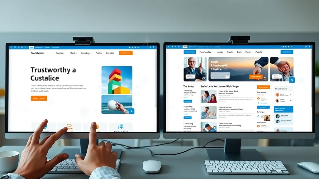
Animated explainer: Visualize a typical customer journey by following a visitor who clicks an online ad. First, they land on a focused landing page—everything needed is at their fingertips, from service details to a clear call to action. In contrast, see the friction as another visitor must click through several pages on a traditional website, hunting for contact info and offers. The animation highlights moments where visitors are lost, where mobile views keep things simple, and how a strong call to action results in more inquiries. This journey reveals why landing pages consistently convert more leads for small businesses.
People Also Ask: Key Questions About Landing Page vs Website
Can a landing page act as a website?
Absolutely. Many small businesses use a single landing page as their main online presence, integrating basic info, testimonials, and a call to action on one scrolling web page. This structure matches modern browsing habits and can be highly effective for lead generation, especially when simplicity and speed are top priorities.
Are landing page and website the same?
No, they have key differences. While both appear online and describe your business, a landing page is typically a focused, single web page built for action (like making contact or booking), whereas a website includes many pages with deeper detail about your business. Both are valuable, but landing pages offer better clarity and conversion for targeted marketing campaigns.
Can a website have a landing page?
Yes. Many traditional websites include specialized landing pages for marketing or advertising campaigns. These pages are used as entry points for visitors from ads, social media, or search engine results and are designed to generate a specific response—like a sign-up, booking, or quote request—without distractions from other site content.
Are landing pages still relevant?
Absolutely—landing pages are more relevant than ever. With mobile-first browsing and shorter attention spans, focused landing pages are often the best way to rapidly capture online leads, especially for small businesses running targeted marketing or advertising efforts.
FAQs about Landing Page vs Website
-
What is a landing page and how is it used for lead generation?
A landing page is a single, focused web page designed to guide visitors toward a specific action—like contacting your business, making a booking, or downloading an offer. By minimizing distractions, landing pages consistently achieve higher conversion rates in targeted campaigns. -
How does a clear call to action improve landing page performance?
A clear, visible call to action tells visitors exactly what to do next—removing hesitation and increasing the likelihood of inquiry or booking. Landing pages highlight this action for better results. -
When should a small business consider a landing page instead of a website?
If your main goal is lead conversion from ads, promotions, or single services, a landing page is usually the better choice. It’s ideal for campaigns where simplicity, speed, and clarity are key. -
How does mobile design impact conversions on landing pages vs websites?
Mobile-optimized landing pages make it easy for users to take action from their phones, with faster loading and simpler structure. Complex websites can lose mobile leads due to slow speeds or awkward navigation.
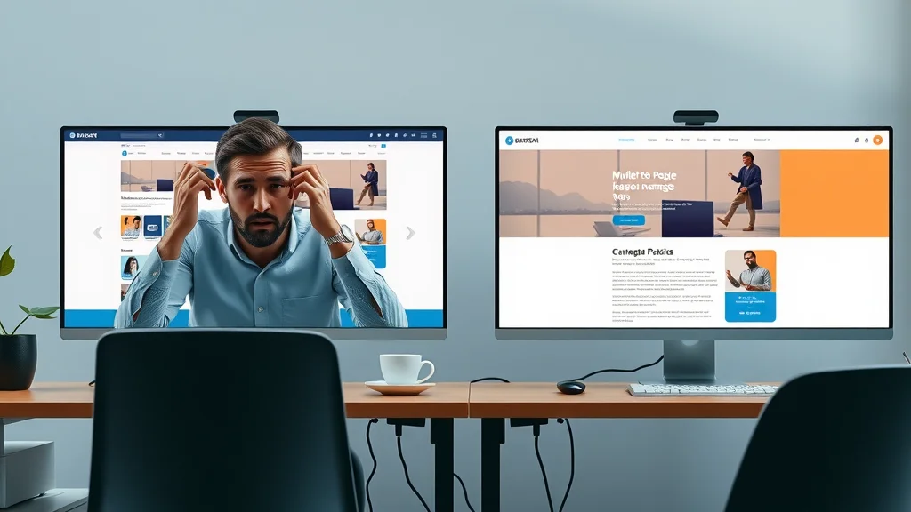
Watch sample case studies that showcase the difference in lead generation results between small businesses using focused landing pages and those relying on traditional multi-page websites. Clear layouts, visible calls to action, and mobile-first flow put landing pages ahead in driving customer action.
Key Takeaways for Small Businesses: Landing Page vs Website
- Clarity and ease-of-use win customer attention and drive more leads
- All website decisions should match how your customers behave online
- Landing pages often outperform traditional websites for lead generation
- Mobile-first, fast, and simple experiences are essential for success
Summary: Choosing the Right Approach for Lead Generation
Visibility and results improve with clarity, consistency, and a focus on user experience
If you want to win more leads, remember: clarity, speed, and simplicity are your greatest assets. Small businesses that make it easy for customers to understand what’s offered—and what to do next—are chosen more often.
Discover How Lead Generation Websites Work
Learn more about creating effective lead generation websites for your business: https://localauthoritycontentsystem.com/lead-generation-website-system
If you’re ready to take your digital strategy to the next level, consider how a broader content system can amplify your results. The Local Authority Content System™ offers a comprehensive approach to publishing, helping you build trust, authority, and visibility across your entire online presence. By integrating structured publishing with your landing pages and websites, you can unlock advanced techniques for sustainable growth and long-term lead generation success.


Write A Comment