


How do customers really interact with your website—and does it matter whether they click through menus or simply scroll? The way people browse the modern web is changing fast, and small businesses need to keep up if they want to turn web visitors into real customers. Many owners think their website gives a strong first impression, but the truth is, most visitors decide whether to stay or leave in just seconds. Are too many clicks driving your customers away? Or could a simpler, scroll-friendly website help you stand out?
A Fresh Look at Website Navigation vs Scrolling in Modern Web Design
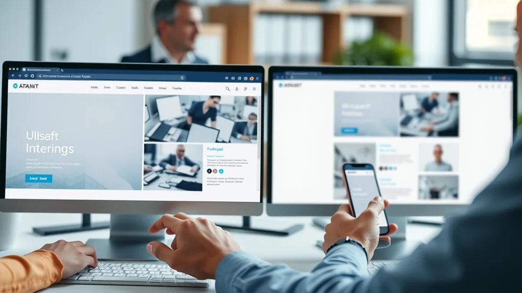
Understanding website navigation vs scrolling is a key challenge for small businesses that want to connect with today’s customers. When someone lands on your website, they quickly look for signs that you offer what they need. Traditional website navigation uses menus, links, and multiple pages—forcing visitors to click around just to find basic information. In contrast, modern web design often prefers scrolling, letting users glide down a single, longer page where they can see everything at a glance. The difference may seem minor, but it determines whether you keep attention or lose it in just a few moments.
In the modern web environment, having a complicated menu or requiring too many clicks is more than a design issue—it's a potential source of lost business. Friction increases with every click, especially for busy customers on mobile devices. Small businesses that stick to older, multi-page designs may find their bounce rates climbing as visitors seek out easier options. By adapting to scrolling-first experiences, business websites can offer content that matches current browsing habits, reduces friction, and increases the likelihood of turning a casual browse into a clear conversion—whether that means a call, booking, or contact inquiry.
Why Do So Many Websites Struggle to Turn Visitors Into Customers?
Most small businesses invest heavily in their websites, expecting more customers to follow. Yet many struggle to turn online traffic into real leads or sales. Why does this happen? The answer often lies in a mismatch between what businesses show and what users expect. People browsing the web today act quickly—often scanning rather than reading, looking for immediate proof that the business can help them, and seeking out the path of least resistance to take the next step. If a website requires too many decisions, forces visitors through a maze of pages, or hides important information, people get frustrated and leave. Slow-loading pages and unclear calls-to-action add more barriers. In a world where attention spans average just 8 seconds, clarity, speed, and simplicity are now decisive factors for conversion.
For small businesses aiming to maximize every visitor interaction, understanding the nuances of user experience is essential. If you want to dive deeper into how structured content and local authority publishing can further enhance your website’s effectiveness, explore the Structured Local Authority Publishing approach for actionable strategies.
What You'll Learn About Website Navigation vs Scrolling
- Key distinctions between website navigation and scrolling
- How user experience shapes browsing habits in the modern web
- Best practices in web design for small businesses
Understanding Website Navigation vs Scrolling: The Essentials
The choice between website navigation vs scrolling isn’t just an aesthetic decision. It shapes how visitors interact with your content, how quickly they understand your offer, and even whether they take actions that turn them into customers. Traditional navigation still has its place, especially for larger sites with lots of information, such as real estate directories or news portals. However, for local service providers, restaurants, home repair companies, or any small business wanting more leads, streamlining the experience makes a big difference. Let’s break down what makes navigation and scrolling distinct—and why it matters for your business’s online success.
Website Navigation: Multiple Pages, Menus, and Interaction
- How traditional website navigation impacts user experience
- Friction points: Too many clicks and multiple pages
Traditional website navigation relies on multi-level menus, links to various service pages, about sections, and more. This structure used to help users find information, but it now often slows down browsing—especially on mobile devices where tiny menu buttons and hidden drop-downs add to the confusion. Each page click is a micro-decision, requiring visitors to wait for a new page to load and then re-orient themselves. The more times you ask your user to click, the greater the chance they’ll leave without finishing their journey. For small businesses, this often means losing visitors before they ever see your main offer or call-to-action.
A critical issue with multiple pages is the cumulative effect of friction. Visitors scanning quickly for answers may not see the value if it’s hidden behind several menu clicks. Frequent page reloads and long page lengths also slow down the overall experience, especially on slower connections. While robust navigation can help organize lots of content, for businesses seeking conversions—calls, bookings, requests—a simpler approach, minimizing unnecessary clicks, generally performs better. This shift is part of the modern web move toward clarity and speed in web design.

Scrolling: Guiding Visitors with Modern Web Design
- Why infinite scrolling and long pages suit mobile-first design
- Comparing layout simplicity and conversion rates
Modern web design increasingly favors vertical scrolling, especially for smaller business websites and landing pages. In a scrolling-first design, all essential information is presented in a single, fluid experience—letting users glide down naturally with their mouse or finger. This approach eliminates the need to hunt through menus or wait for new pages to load, which is especially important for mobile users. Infinite scrolling or longer pages let the visitor stay engaged, discovering key messages, photos, testimonials, and calls-to-action all in one place. This reduces decision fatigue and makes it easier for users to compare options, understand the offer quickly, and take action.
Scrolling aligns with how people use the internet today—especially on mobile devices. There’s less interruption and no need to memorize complex menu structures. For businesses focused on conversions, laying out content in a single scroll means customers can see the entire story at once, increasing the likelihood of engagement. Simpler layouts also often mean faster loading times, further reducing bounce rates. The result is a user experience that fits the mental model of modern consumers: quick, intuitive, and designed for action.
How Scrolling Shapes User Experience on the Modern Web
In today’s digital landscape, user experience is shaped by how well a website matches natural browsing behavior. For most visitors, the first impression is formed almost instantly—the layout, load time, and visible calls-to-action determine if a business seems trustworthy and relevant. Design decisions such as page length, content placement, and navigation method all contribute to shaping those crucial first seconds. Scrolling-first sites are particularly well-suited to the modern web, where consumers expect directness and speed. Let’s look at how this impacts real user behavior and the way businesses present themselves online.
The Science of User Behavior: Scanning, Skimming, and Decision Making
- Most users form first impressions instantly
- Attention span and how it impacts web design choices
Scientific studies and user behavior research consistently reveal that most website visitors do not read content word for word. Instead, people scan headings, notices, images, and calls-to-action—making snap judgments about whether to stay or go. The average attention span when landing on a new website is about 8 seconds, meaning if the value proposition isn’t immediately visible, most visitors will leave and compare other options. This behavior is seen across all industries—from retail stores and medical providers to home services and real estate—with few exceptions.
For web design, this means businesses must present their offers, benefits, and contact methods upfront. Scrolling supports this by allowing the most important messages to be placed prominently before more details. Menus, on the other hand, force deeper reading and require users to navigate with more mental effort. In practice, scanning and skimming lead to higher engagement on websites that are designed for quick consumption and clear next steps—a key reason why scrolling is preferred in the modern web.

Mobile Browsing: The Case for One-Page Website Design
- Mobile device dominance and scrolling-first behavior
- Why fewer clicks improve conversion and reduce friction
Today, the majority of web browsing happens on mobile devices, and mobile-first design has become the new standard. On smartphones and tablets, tapping and scrolling are far easier than navigating tiny, complex menus or loading multiple pages. This “thumb-friendly” browsing lets users move seamlessly down a page, discovering all they need without leaving the context or waiting for a new page to load. As a result, one-page websites and single-scroll landing pages have become highly effective for small businesses seeking fast connections with prospective clients.
Reducing the number of clicks is not just about convenience—fewer clicks mean fewer chances for a user to quit or lose focus. Every additional page load is an opportunity for distraction or frustration, especially if waiting times are long or menu structures are confusing. By delivering all key messages on a single, streamlined page, businesses remove barriers between the visitor’s first impression and their decision to contact, book, or purchase. This naturally leads to better conversion rates and provides a smoother user experience.
Infinite Scrolling vs Multiple Page Navigation: Pros and Cons
| Method | Pros | Cons | Best Use Case |
|---|---|---|---|
| Infinite Scrolling |
|
|
Blogs, social networks, product catalogs with large numbers of items |
| Multiple Pages |
|
|
Complex business websites, news outlets, real estate directories |
| One-Page Website |
|
|
Local services, small businesses, promotional sites, restaurants, professional portfolios |
Clarity Above All: How Simple Web Design Wins
- Clear messaging and immediate offers for user experience
- Examples of effective calls-to-action and next steps
Clarity is the single most important factor for web design success. Visitors should be able to answer three questions within seconds of landing on your site: What do you do? Who do you serve? What should they do next? Simple, intuitive design makes this possible. Immediate displays of key offers, prominent contact buttons, and bold calls-to-action all help users make decisions without hesitation. Confusing layouts, hidden menus, or slow-loading elements increase the risk that people will give up and consider a competitor instead.
Effective calls-to-action are both visible and easy to understand—for example, “Book an Appointment,” “Request a Quote,” or “Call Now for Consultation. ” These should be placed where the user’s eye naturally lands as they scroll, often at the end of each important section. Web design that guides visitors naturally through the conversion funnel—without requiring deep reading or multiple clicks—wins in the current digital landscape. The best-performing sites make it as easy as possible for customers to take the next step.
Why Page Speed and Modern Web Design Matter for Lead Generation
- How page length, web design choices, and loading time affect user engagement
- Simple, fast, and mobile-friendly layout for conversions
Page speed is a fundamental piece of user experience and a deciding factor in whether your site can generate leads. Every extra second a page takes to load increases the likelihood that a visitor will abandon your site. This is especially impactful on mobile devices, where less reliable connections and smaller screens amplify the frustration of slow pages. Modern web design practices recommend streamlined layouts—fewer images, well-optimized graphics, and single-page architectures—to maximize both speed and clarity.
For lead generation, a simple, fast, and mobile-friendly layout is crucial. Shorter load times mean visitors stay engaged, while easy-to-read text and prominent calls-to-action help guide users toward requesting a service or contacting your business. Remember: The best website is not just the one with attractive graphics but the one that loads quickly, works seamlessly on all devices, and tells your story clearly from the start.

Watch: Explaining Website Navigation vs Scrolling for Small Businesses
Lead Generation Websites: Connecting Visibility and Action
A website’s true value is measured not just in traffic, but in the actions visitors take. For small businesses, that means guiding every prospect toward a clear next step—calling for an appointment, completing a booking, requesting a quote, or sending a message. The most effective lead generation websites are those that bridge the gap between being seen and being chosen. They do this by combining clear structure, simple scrolling, and direct calls-to-action into a seamless experience. If a business cannot show its value in seconds or guide a visitor toward an action, competitors with more user-friendly sites will capture those leads instead.
Turning Traffic Into Customers: Guiding User Decisions
- Guided actions and why web design company principles matter
- How small businesses build trust and results through consistent structure
Guided user actions are at the heart of successful online lead generation. Every design choice, from headline placement to button color, should direct attention toward taking the next step. Consistent structure—such as a repeating contact form at the bottom of each section or a sticky “Contact Us” bar on mobile—builds trust through familiarity and reduces decision fatigue. Small businesses that work with a web design company experienced in modern, conversion-focused design often see better results than those with generic, multi-page templates. Why? Because the best practices for lead generation—clarity, speed, and ease-of-use—require intentional design and an understanding of what users truly want from a website.
Remember, business websites are competing not just for attention but for trust. Site visitors may compare several service providers after a single search, often choosing the first site that makes sense and offers a simple path to connect. Consistent structure and clear calls-to-action reassure users that they’re in the right place and can expect results if they reach out. This is a fundamental principle for all small businesses, regardless of industry.
Watch: Real-World Examples: Lead Generation Through Clear Web Design
People Also Ask: Common Questions About Website Navigation vs Scrolling
What are the 4 types of website navigation?
The four main types of website navigation are global navigation (main menus visible on every page), local navigation (section-specific links), contextual navigation (links within page content guiding deeper into topics), and footer navigation (secondary menus at the bottom with less critical links). Each serves different roles, but for small businesses, global and contextual navigation paired with clear calls-to-action often provide the best user experience.
Which is better infinite scrolling or pagination?
Infinite scrolling keeps users engaged with continuous content—ideal for blogs, social feeds, and product lists with high numbers of items. Pagination (separating content across multiple pages) can help users find specific information more easily but increases clicks and loading times. For small business lead generation, neither is universally "better"; the best choice depends on your goals and how your visitors browse. For clear conversions, a single-scroll page often converts higher than either infinite scrolling or multiple pages.
What are the two types of scrolling?
The most common types of scrolling are vertical scrolling (moving up and down a page) and horizontal scrolling (moving side to side). Modern web design nearly always uses vertical scrolling, which feels natural to users, especially on mobile. Horizontal scrolling is typically reserved for image galleries or special interactive content.
What does it mean when a website has good navigation?
A website with good navigation makes it easy for visitors to find what they need quickly and without confusion. This includes simple menus, logical content structure, visible search functions (if needed for larger sites), and clear pathways to take action—like booking a service or contacting the business. Good navigation removes barriers and helps turn interest into real leads or sales.
Key Takeaways on Website Navigation vs Scrolling for Small Businesses
- Simple navigation and mobile-first design drive better results
- Clarity and speed lead to higher conversion and more leads
- Visitors need to quickly understand your value and what to do next
- Consistent, easy-to-compare layouts help businesses stay competitive
"Visitors make decisions fast – the businesses that communicate clearly and reduce friction are the ones that earn trust and more leads."
FAQs: Website Navigation vs Scrolling and User Experience
How does website navigation impact conversions?
Website navigation influences whether visitors can find key information quickly and move easily toward calls-to-action. Complex menus or too many pages raise friction, which interrupts the decision-making process and lowers conversions. In contrast, simple navigation and single-page, scrolling layouts remove barriers, making it more likely visitors will reach out, book, or purchase from you.

Why is infinite scrolling considered a modern web approach?
Infinite scrolling is seen as a modern solution because it caters to how users naturally interact with content today—especially on mobile and social feeds. By loading content continuously as users scroll, it keeps engagement high and removes traditional “page number” barriers. It’s highly effective for blogs, portfolios, and product listings, but less useful for clear, direct lead generation where focused calls-to-action are essential.
Small Changes, Big Results: Building Trust and Leads with Smart Website Navigation
- Clarify your message and remove unnecessary clicks
- Structure your content for scanning, not deep reading
- Guide users toward calls-to-action naturally
- Test your site on mobile for speed and usability

Watch: How User Experience Principles Increase Lead Generation
Discover How Lead Generation Websites Work to Transform Your Small Business
Small improvements in website clarity, structure, and speed can make a big difference in how many visitors turn into customers. Lead generation websites are built to communicate your offer instantly, guide each visitor to action, and deliver consistent results—helping your small business grow trust and recognition over time.
Ready to see how lead generation websites work? Discover How Lead Generation Websites Work to Transform Your Small Business
If you’re looking to elevate your web strategy beyond navigation and scrolling, consider how a holistic content system can position your business as a trusted local authority. By integrating structured publishing and strategic content planning, you can amplify your visibility and credibility in your market. For a deeper dive into building a sustainable, high-impact online presence, explore the Local Authority Content System™ Insights & Strategy. This resource offers advanced guidance on leveraging content structure and authority to drive long-term growth and customer trust.


Write A Comment