


Are you wondering why your website’s contact form is not getting submissions, even though traffic is steady? For many small businesses—local shops, medical providers, service pros, and restaurants—this is a frustrating and confusing problem. You’re not alone if visitors land on your site but never fill in your form or take that next step. In this article, you’ll discover what might be missing from your contact form, why behavior online isn’t what you expect, and proven strategies to turn curious browsers into leads. We’ll break down the key features, common obstacles, and real browsing habits that matter most, so your website can finally capture more customer inquiries.
Introduction: Why Is My Contact Form Not Getting Submissions?
Your contact form is meant to be a bridge between your business and new customers. When that bridge isn’t working, valuable leads slip away. For most small businesses, getting visitor inquiries is a top priority, but many find their contact form not getting submissions despite their best efforts. This article explores why this problem occurs and outlines steps you can take to address it. You’ll learn why website visitors act quickly, why they often leave without reading everything, and how a few small changes to your form and site can have a big impact on your lead generation.
In today’s competitive online environment, it’s not enough to simply have a contact form on your website. You need to understand how people actually interact with your site, what makes them decide to reach out, and what stands in their way. Common issues like confusing design, technical errors, or even a slow web host can all contribute to lost opportunities. By the end of this guide, you’ll be equipped with practical advice to help ensure your contact form is an effective tool for growing your business.

Capturing Attention: The Challenge of Website Conversions
One of the biggest challenges small businesses face online is converting browsers into leads. In a world where the average attention span is around eight seconds, capturing someone’s focus and getting them to submit a contact form is no small feat. Visitors don’t sit down to read every word on your site; instead, they scan quickly, scroll through your content, and make snap decisions about whether to take action. If your contact form or messaging isn’t instantly clear, you may lose them before you even get a chance to connect. That’s why high-performing websites focus on clarity and guiding visitors to the next step with minimal friction.
Clarity, simplicity, and speed are more important than ever. Websites that are easy to understand and navigate make a far stronger first impression. The structure of your site—how information is presented, where your forms are located, and the strength of your calls-to-action—can make the difference between a visitor reaching out or moving on to a competitor. Remember, you only get one chance to convince each visitor that your business is the right choice, so clear and accessible contact options are essential.
The True Cost of a Contact Form Not Getting Submissions for Small Business
When your contact form isn’t getting submissions, the real cost goes beyond missed inquiries—it can mean fewer customers and less revenue over time. For a local business, each unanswered form is a lost opportunity to connect with someone who needs what you offer. Think about how quickly customers compare businesses online: often, they’ll reach out to the first listing that’s easy to contact. If your form is hidden, confusing, or broken, they may not try again.
Consistently missing out on form submissions doesn’t just affect your immediate bottom line; it can impact your long-term visibility and reputation. As online competition increases, every small business needs to maximize online leads. Investing in a better contact form and fixing hidden issues is not just a technical upgrade—it’s a strategic advantage that helps you stand out and win more business in a crowded market.
What You'll Learn in This Guide About Contact Forms and Form Submission
- Common reasons for a contact form not getting submissions
- Critical features missing from many contact forms
- Insights into how website behavior influences form submission
- Best practices for increasing form submissions using a form plugin or form builder
- How business owners can create more effective contact forms and optimize sending email
Understanding the Contact Form: Its Role in Small Business Lead Generation
Why Most Contact Forms Are Not Getting Submissions
Despite having a contact form on your site, many small businesses experience low submission rates. Why? Most contact forms are not designed with the visitor’s behavior in mind. People moving quickly through your website won’t hunt for confusing links or figure out unclear instructions. When the form is hard to find, hidden behind multiple clicks, or filled with too many questions, visitors lose interest fast. Using a complex form plugin or builder may also introduce unnecessary fields or steps, creating more friction for potential customers.
Another reason contact forms go unused is a lack of immediate clarity. If it’s not obvious why someone should fill out your form or what happens after they submit, they are likely to move on. A compelling call-to-action and reassurance—such as a quick confirmation email or message—can make all the difference. Remember, every second counts, and even small design or wording choices can affect form submission rates.
For a deeper dive into how structured publishing and content organization can further enhance your website’s ability to convert visitors, you might find the insights from the Structured Local Authority Publishing approach especially useful. This method emphasizes clarity and logical flow, which are crucial for both user experience and higher submission rates.
How Visitors Really Behave Online: Scanning, Scrolling, and Comparing
Today’s online visitors scan and scroll through sites far more than they read pages in depth. Research shows most people decide whether to stay or leave a website within a matter of seconds. They often compare multiple businesses, scrolling through homepages and service sections before making a decision. Because of this, your contact form must be visible and simple—not hidden away behind tabs or buried on a separate page.
Mobile browsing is now the dominant way people interact online. This changes the way contact forms should be presented. Mobile users especially benefit from forms that are easy to fill out, with large touch-friendly fields and minimal typing. If your site or form isn’t designed for these real-life habits, you’re missing a large segment of potential inquiries. Websites that adapt to this scrolling and scanning behavior have a clear advantage in attracting leads and converting visitors to customers.
Conversion Explained: Turning Visitors Into Customers Through Form Submission
Conversion, in the context of a small business website, means turning a visitor into a customer by getting them to take action—whether that’s sending a message, making a booking, or requesting a quote. Your contact form is the most direct pathway to this result. But simply having a form isn’t enough; you must minimize the distance between a visitor’s arrival and their decision to reach out.
Guiding visitors to convert involves more than just technology. It requires clear messaging that immediately communicates what your business offers, why it matters, and what will happen next. When visitors can easily find a contact form, understand how their information will be used, and see a strong call-to-action, conversion rates improve. Making this process seamless doesn't just capture more leads—it builds trust and encourages long-term customer relationships.
Common Issues: Why Your Contact Form Is Not Getting Submissions

Poor Clarity and Confusing Messaging in Contact Forms
One of the most common issues causing a contact form not getting submissions is poor clarity in how you ask for information. If your form uses vague or technical language, visitors will hesitate to provide their details. Instructions like “Fill in the form below” without specifying what happens next may leave users questioning whether their inquiry will even be read. Forms that lack a clear purpose or that don’t reassure visitors about privacy can also reduce trust and lower response rates.
Every contact form should clearly communicate what’s expected and what the benefit is for the person submitting. For example, stating “We’ll respond within 24 hours” or “Your information is private—we won’t share it” can make the form feel safer and more inviting. If you’re using a form plugin or form builder, double-check that field labels and instructions are written in plain, friendly language that matches how your customers speak. A confusing form is one of the quickest ways to lose potential leads.
Too Many Steps: When Contact Forms and Form Plugins Frustrate Visitors
It’s natural to want to gather plenty of information from new prospects, but extensive forms with many fields often backfire. Each extra question or step adds friction, causing more visitors to abandon the form before completion. Overly complex forms—especially those created with a form plugin or builder that come preloaded with unnecessary fields—can result in fewer, not more, inquiries.
Visitors prefer straightforward interactions. Ask only for the essentials—typically name, a method of contact (like phone or email address), and a brief message. Shorter forms are proven to have higher completion rates. Additionally, if your form requires users to click through several screens or tabs, consider consolidating everything onto a single, simple page. This approach aligns with how people naturally interact with websites: scrolling down, not clicking through.
Mobile-First Mistakes: When Contact Forms Fail on Smartphones
With mobile browsing now dominating online traffic, a contact form that isn’t mobile-friendly is a major missed opportunity. Many common issues stem from form fields that are too small, buttons that are hard to tap, or layouts that simply don’t work well on smaller screens. If a visitor tries to submit your form from a smartphone but faces any hurdle—be it awkward zooming or overlapping fields—they are likely to give up and look elsewhere.
To avoid losing mobile visitors, test your contact form across different devices and browsers. Ensure it loads quickly, is easy to complete with just a few taps, and that text is always readable. Form plugins and builders should have mobile-first options built in; take advantage of these features, or consider switching to a tool that prioritizes modern, responsive design. With most customers checking websites on their phones, mobile-first forms are no longer optional—they’re essential.
Technical Obstacles That Prevent Form Submission
Email Delivery and Spam Folder Problems When Sending Email
Even if visitors complete your form, technical problems with email delivery can mean you never see their message. One common issue is when emails end up in the spam folder rather than your inbox. This often happens if your website sends form notifications using php mail or a basic SMTP plugin that isn’t correctly configured. Some email providers—like Gmail or Outlook—have strict spam filters, so if the sending email address doesn’t match your domain or fails authentication, your messages can disappear.
The solution is to use a reliable mail server and configure smtp plugins properly. Sending a test email after changes can help you identify if form submissions are being routed as they should. Regularly check spam folders and utilize a reputable smtp provider if your current service fails. By making sure every form submission is delivered reliably, you avoid missing valuable leads that you never knew existed.
Form Plugin and Form Builder Errors: Hidden Error Messages
Sometimes, form plugins or form builders display hidden error messages that neither you nor your visitors see. This can occur because of a conflict between plugins, a misconfigured mail transfer protocol, or even a web host that blocks outgoing mail. As a result, visitors believe their submission was successful, but you never receive an alert. Many businesses don’t catch the problem until someone complains or takes the time to follow up elsewhere.
Diagnosing these hidden errors involves regular testing. Send a test email periodically and check your plugin’s support forum for bug reports or updates. Most quality form plugins provide clear error message reporting—use it! If your current system fails quietly in the background, it’s time to review your settings and possibly try a more reliable form builder or mail server setup. Error messages are not just technicalities—they directly affect whether your customers can reach you.

Page Speed and Website Structure: Impact on Form Submissions
Slow-loading pages are a silent killer for conversions. If your site—or just your contact form—takes too long to appear, visitors may leave before ever filling anything out. Heavy form plugins, unoptimized images, and cluttered layouts all affect how quickly your page loads, especially on mobile networks. Recognize that a difference of just one or two seconds can decide whether a visitor stays to submit your form or bounces to a competitor’s site.
Website structure also matters. The more complicated your navigation, the harder it is for visitors to reach the contact form. A simple, one-page layout with a prominently featured form reduces the number of clicks required and keeps the visitor’s attention focused. This matches natural website behavior and is proven to increase lead generation for small businesses across all industries.
Best Practices: How to Fix a Contact Form Not Getting Submissions
- Keep contact forms simple and mobile-friendly
- Use clear calls-to-action to guide form submission
- Check form plugin settings for hidden obstacles
- Ensure sending email is working and not being marked as spam
- Test contact forms regularly across devices for errors
By following these steps, small businesses can dramatically improve their online lead generation. Simplicity, clarity, and technical reliability all contribute to a higher submission rate and a better customer experience.
Key Elements Your Contact Form Might Be Missing
Essential Features All Effective Contact Forms Should Include
Not all contact forms are created equal. High-performing forms include a few essential features: clear field labels, a visible and inviting submit button, a brief explanation of what happens next, and privacy assurances. Use tools like a tested form plugin or a reputable form builder to streamline the process, ensuring visitors can submit their inquiries without confusion.
Other effective features include sending an automatic confirmation email or displaying a thank you message so users know their request was received. Mobile-responsiveness, minimal required fields, and accessible design (with proper color contrasts and large tap areas) all contribute to a form that feels easy and safe to use. Missing out on any of these components may be the difference between a potential lead and a missed opportunity.

How Clear Messaging Boosts Form Submission Rates
Clear, direct language in your contact form drives results. Visitors are far more likely to complete a form if instructions make sense on the first read. Spell out the process (“Fill in this form and our team will call you within a day”), keep questions straightforward, and avoid jargon. Consider explaining the value of submitting—such as offering a fast response or a free consultation. Simple messaging provides reassurance and encourages more visitors to take action.
Remember, people decide almost instantly whether your site feels trustworthy. If they see complicated text or unclear directions, they will hesitate. Regularly review your messaging to ensure it’s easy to understand and leaves no doubt about what to do. When in doubt, ask friends or staff outside your industry to fill out your form and give feedback on clarity.
Strong Calls-to-Action: Showing the Next Step
A strong call-to-action (CTA) tells your visitors exactly what to do and why. Examples include: “Request a Quote,” “Book Your Free Consultation,” or “Contact Us Now. ” Using action-oriented, benefit-driven language at the top of your contact form removes uncertainty and provides that gentle nudge visitors need to take the next step.
Place your CTA where it’s clearly visible, and consider using a contrasting color for the submit button so it stands out. This not only improves the look of your form but also guides the eye, making it much more likely people will follow through. The right CTA can make your business the obvious, easy choice among competitors in search results.
How Small Businesses Compete Online: Beyond Just Contact Forms
Clarity, Simplicity, and User Experience Matter for Form Submission
Today, small businesses compete in a marketplace where first impressions are everything. Customers browsing online rarely give websites more than a few seconds of attention. They are looking for instant answers and clear paths to contact. A user-friendly experience, including an intuitive contact form, reflects well on your business and increases the likelihood of winning new customers. Not all potential leads will wait for the perfect message—those with the clearest, simplest forms often get contacted first.
Focus your efforts on what matters: clear layouts, direct messaging, and effortless navigation. The easier it is for a visitor to understand your site and reach out, the better your chances for success. These basic principles work equally well across all industries, from medical practices and service contractors to retail stores and restaurants.
Why Website Structure and Form Plugins Directly Impact Conversions
The structure of your website—and the form plugin or builder you choose—affects conversion rates more than you might realize. Overly complex navigation, multiple steps, or poorly-configured plugins add barriers that stop visitors in their tracks. Modern lead generation web design embraces simplicity: single-page layouts, anchored contact forms, and fast, visible calls-to-action consistently outperform more complicated alternatives.
Avoid plugins or builders that offer endless customization at the expense of clarity. Instead, select tools that are known for reliability, clear error message reporting, and easy integration with your email provider. Continuous testing, fast load times, and logical structure encourage visitors to start and finish the process, leading to more reliable form submission results.
Comparing Contact Forms: What Sets High-Performing Sites Apart
High-performing sites aren’t just “prettier”—they’re simpler, faster, and easier to navigate. Comparing two contact forms side by side reveals this fact: clean, minimal forms with just a few fields and a strong call-to-action consistently result in more submissions than cluttered, confusing ones. Content hierarchy matters too; if your instructions and buttons are lost among ads, pop-ups, or irrelevant text, even the most interested visitor may give up.
The difference in performance is often dramatic. Businesses that keep their forms short and sweet, check for technical errors, and update their design for mobile users benefit from more leads and better online reputations. Every update toward simplicity and transparency is a step ahead in a crowded local market.
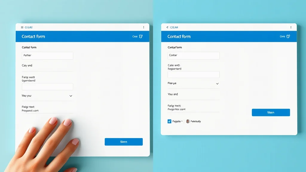
Table: Comparison of Frequent Barriers to Successful Contact Form Submissions
| Barrier | User Impact | How to Fix |
|---|---|---|
| Unclear Instructions | Causes confusion, drops submission | Add simple, direct language |
| Poor Mobile Performance | Fields hard to use, visitors leave | Optimize for mobile, minimize fields |
| Delayed Email Delivery | Confirmation not received | Check email delivery, test regularly |
| Hidden Error Messages | Users think form works but it fails | Improve error reporting, test plugins |
Expert Insight: Why Your Contact Form May Not Be Getting Submissions
“Even small details—like unclear field labels or missing confirmation—can derail a contact form. Visitors judge instantly and move on if confused. ”
This observation from UX experts and web designers is echoed across all industries: the details matter. Reviewing each part of your contact form for clarity, speed, and feedback makes all the difference between lead generation success and missed opportunities.
Top Frequently Asked Questions About Contact Form Not Getting Submissions
What are the most common reasons my contact form is not getting submissions?
The most common issues are confusing instructions, too many required fields, mobile usability problems, poor page speed, email delivery problems (such as emails landing in the spam folder), and hidden technical errors in your form plugin or form builder. Even small mistakes can prevent leads from reaching you, so regularly review your form from a new visitor’s perspective.
How can I check if my contact form is working properly and sending email?
Test your form by submitting it yourself and verifying you receive the email promptly. Review all spam folders and consider using an SMTP plugin to improve email delivery reliability. Send a test email from your site’s contact form regularly. If messages aren’t arriving in your main inbox, troubleshoot plugins, check your mail server configuration, and confirm your sending email address is approved by your email provider.
Should I use a form plugin or form builder for better results?
Quality form plugins and form builders offer customization, spam protection, and easy integration with your mail transfer protocol. However, some can be overly complicated or poorly supported. Choose a plugin or builder that prioritizes mobile friendliness, accessibility, error reporting, and ease of use. Test your chosen tool often, update when needed, and always monitor for error messages.
How does page speed impact form submissions on my small business website?
Slow websites discourage visitors—most will leave if a page takes too long to load, especially on mobile devices. Fast-loading contact forms improve the chances visitors will stay and complete the submission. Optimize images, streamline plugins, and reduce clutter to improve page speed, increasing your conversion and form submission rates.
Can error messages and spam folder issues prevent form submission?
Yes. If users encounter confusing or hidden error messages, they may not realize their form submission failed. On your end, if emails from your site are landing in your spam folder or being filtered out by your provider, you’ll miss customer inquiries. Regularly test your site, review both obvious and hidden messages, and configure your mail delivery setup to avoid these pitfalls.
People Also Ask: Troubleshooting Contact Form Not Getting Submissions
Why is my contact form not sending email?
This issue often comes down to mail server misconfigurations, problems with the php mail function, or your web host’s email restrictions. Consider configuring an SMTP plugin and double-check your form builder or plugin settings. Make sure your sending email address matches your domain and is verified with your email provider.
What does it mean if my form says 'submission failed'?
A “submission failed” error message typically means something went wrong in the form processing—this could be a technical glitch, a server issue, or a misconfigured plugin. Check all required fields, ensure your mail transfer protocol (such as SMTP) works, and test the form on different devices. Consult the plugin’s support forum for troubleshooting advice if needed.
How do I make my contact form more user-friendly?
Keep your form short and put essential fields front and center. Use clear instructions, large buttons, and a simple design that works well on mobile devices. Choose a reputable form builder or plugin, avoid unnecessary questions, and provide reassurance with confirmation messages or emails. Test your form often and review it for accessibility.
Are form builder tools always reliable for contact forms?
Not all form builder tools are equally reliable. Issues can arise from poorly coded plugins, lack of updates, or incompatibility with your web host or mail server. Stick to well-reviewed, regularly updated form builders and always monitor for technical issues or error messages. Hands-on testing is essential to catch problems early.
Key Takeaways for Small Businesses: Improving Contact Form Submission Rates
- Visitors decide quickly and do not read everything—first impressions of your form matter most
- Mobile-first, simple, and clear design directly increases form submissions
- Technical details like email delivery, error messages, and page speed must be checked
- Strong calls-to-action and clear messaging set your business apart from competitors

Conclusion: Driving More Leads with a High-Converting Contact Form
Building Trust and Action Through Clarity and Structure
A high-converting contact form helps your business stand out—not just by looking good, but by being easy to use, clear in its messaging, and reliable in sending email. When every detail is optimized, you invite more leads and build lasting trust with local customers.
Final Thoughts on Sustained Online Visibility and Customer Choice
Visibility and results develop over time, but each simple improvement in clarity, structure, and communication increases your chances of being chosen. Consistency and attention to these details help small businesses grow stronger online—and with the right contact form, more visitors become loyal customers.
If you’re ready to take your online presence to the next level, consider exploring the broader strategies behind content authority and digital trust. The Local Authority Content System™ Insights & Strategy offers a comprehensive look at how structured publishing and strategic content can elevate your business above the competition. By integrating these advanced techniques with your optimized contact form, you’ll be well-positioned to attract, engage, and convert more of your ideal customers—building a foundation for long-term growth and authority in your local market.


Write A Comment